How to build a brilliant dashboard – 10 essential tips
Here’s a quick summary of 10 key points you need to take into account when you build a dashboard.
1) Know your target audience
You cannot make everyone happy with one dashboard. If you have more than one target group it may make sense to create a separate dashboard for each group. Be sensible and don’t take on an impossible task.
2) Talk to your target audience
Don’t work in a vacuum, find out what the target audience do and don’t like about the current reporting. What decisions or actions do they need to take based on the information you are providing? Where are the gaps and confusion currently? Dashboards are often used in meetings and discussions, find out which ones and what they are supposed to achieve.
3) Know the strategic objective that you are trying to address with the dashboard
Dashboards, MI and KPIs are supposed to propel you in a strategic direction. Make sure your dashboard is pushing your the right way. Use a technique like my Results Onion technique to create a visual map linking your strategic objectives to your everyday measures (and to create helpful “Composite KPIs”)
4) Don’t use the existing dashboards and reports as your start point (unless you have to)
As Henry Ford said (or maybe didn’t), “If I’d asked my customer what they wanted I’d have given them a faster horse”. People often can’t imagine what they haven’t seen before. The designer of the dashboard has a duty to come up with innovative, surprising and appropriate solutions. By all means discuss the dashboard with the end-user, but make sure you have at least two or three mocked-up options on the table to help move the discussion forward.
5) Mock it up (and save yourself a tonne of work)
Use Visio (PC), Omnigraffle (Mac) or good-ol-fashioned “paste as Windows metafile” into a Word document. Create a rough mockup of the dashboard(s) so that you can easily discuss, rejig and refine your prototype. Use dummy data at this stage to speed things along.
6) Build a prototype with real data, but don’t get bogged down in the behind-the-scenes detail
Get the front end graphs working first, with a tidy human-friendly data table behind it. The chances are the end-user will change their mind once they have seen a working prototype, so don’t commit to an automated back end until a couple of production iterations have passed.
7) Use strong, tested, visual design principles
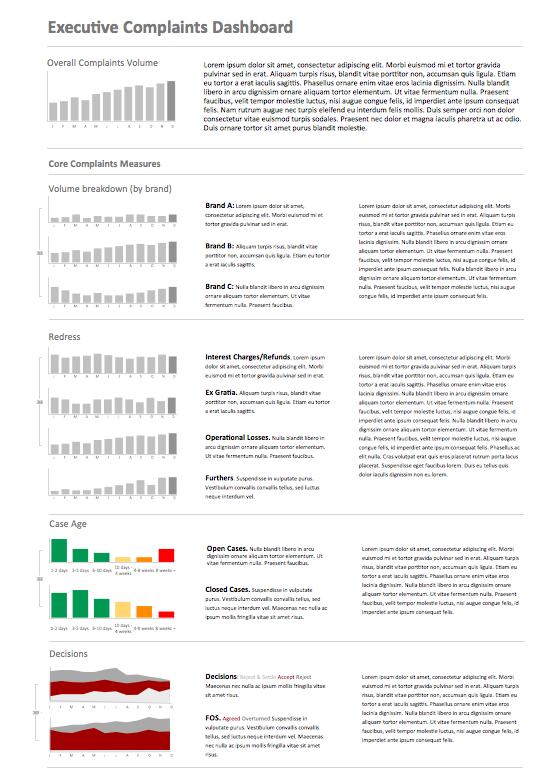
Do some reading (this site is a good start) on the visual design principles that aid understanding. Stephen Few is a big noise in this field and I’d recommend his work. Jon Moon also has a fantastic approach to laying out documents. I have also written an eBook, BlinkReporting (which you can buy and download here). The dashboard below was produce using my BlinkReporting design method.
8) Avoid gimmicks, clutter and random use of colour
Many IT companies push clients towards flashy dials, gauges and thermometers. Ultimately they act as a barrier to understanding (look at the Stephen Few link in tip 7 to read a bit more about why this is). Simplicity goes hand-in-hand with clarity. Use the simplest graphical devices that do the job. Remove all clutter from the graphs (see how with this tutorial). Only use colour when it means something and aids understanding
9) Accept that some people will initially dislike the change
I’ve learned from experience that many of my clients who ultimately loved my work, but didn’t at first. People take a while to get used to a dashboard. Don’t over-react if people are a bit negative or confused at first. Give it a bit of time to settle and tweak things that are clearly open to improvement, however….
10) If people still have issues after a few production cycles of the dashboard, LISTEN
Don’t be intransigent, be sensible. If there are rational and persistent reasons to change, then do so.
If you need some help with your dashboard then give me a call. I’d love to help.
I’ll be adding some practical tips on how to make Excel dashboards look better than you possible imagined, so don’t forget to check back.


")
