What is Key Performance Index: Your Ultimate Guide to Brilliant Index KPIs
When it comes to an organisation's strategic goals, key performance indicators (KPIs) are the most valuable tool we've got to measure progress. However, the formula for effective performance management doesn't only entail tracking KPIs; it is of crucial importance to choose the right performance measures if you want to achieve your targets.
Many performance managers know that monitoring the right KPIs can become a time-consuming task when you have, say, 40 of them. Enter: the key performance index. We at Made to Measure KPIs have developed this ultimate guide to help you understand how this subset of KPIs can impact your business.
We've covered everything from what is key performance index and examples to illustrate, right through to an entire step-by-step system to help you create them for yourself. Use the Table of Contents below to navigate to where you want to go or simply continue scrolling for everything you need to know.
What is Key Performance Index?
Before we can answer this question, we need to know what a key performance indicator is: a KPI is a singular measure used to quantify the performance of an individual, team, or organisation. A key performance index, also known as an index KPI, is a measure that is calculated based on two or more input KPIs.
Index KPIs are designed to give a simplified summary of multi-measure situations. Put another way, we have a bunch of KPIs that we're monitoring on a weekly basis but now we find a way to roll them all up into one metric, an index, representing them all. So instead of monitoring each KPI individually, we monitor the index. What a time-saver!
Key Performance Index Examples
Here are some index KPI examples you have probably stumbled across without even noticing that they are index KPIs...
- BMI - Body mass index. An indication of "lean-ness" in a single number
- FTSE 100 - A stock exchange index showing how the UK stock market is performing
- Weight Watchers Points - A measure that mixes calorific content, fat and fibre content to give a "food healthiness score"
- Credit score - using past credit behaviour to assess capacity and willingness to pay back lending
- Exam result - An indication of an individual's understanding of a topic
- RPI - The Retail Price Index: a UK government measure used to show how a selected "basket" of prices have increased
- OEE - Overall Equipment Effectiveness: a measure of efficiency that factors in quality, up-time and speed in production operations
- Activity "scores" used by fitness monitoring gadgets like the Apple watch
- Eco Score on a Toyota Prius dashboard - An indication of how efficiently you are driving for a given set of conditions (speed, distance, etc.)
The more you look, the more you spot them. It's important to note that index KPIs can be made up of leading and lagging indicators - purely leading indicators, purely lagging indicators, or a combination of both. Hop on over to our Key Performance Indexes: FAQs page to read more about that.
The Role of Index KPIs in Business Strategy
Now that you know what it is, you might be wondering if it's something YOU really need… Consider this familiar scenario: you attempt to fit all your measures onto a single A4 or foolscap page. After much negotiation and using smaller and smaller font sizes, you manage to fit everything onto one page and hope like hell the reader has 20/20 vision. However, when you present it to your organisation's executive, they add half a dozen more measures and charts, blowing any chance of a one-page dashboard.
At this point you have two options:
- Leave something out
This is the easiest option, but also risky. In some businesses, it really is impossible to fit every relevant measure on one page. There is often fierce debate amongst individual 'interest' groups about which should be included. The surviving measures are often more an indicator of the political power of the stakeholder than of business relevance. Imagine if the designer of the next aircraft you flew in decided to leave some of the instruments out of the cockpit as 'there's not really enough space for them' - not a pretty thought, is it? - Roll several of your KPIs into a performance index
Performance indexes, a.k.a. index KPIs, are a special kind of measure that combines several 'real' KPIs into one measure (and that one measure isn't something that you can see/hear/touch/count). Performance indexes are surprisingly commonly used, but it's easy to forget that they are 'artificial' and had to be designed at some point.
Of the two approaches to saving dashboard space, a performance index is absolutely the best solution to the 'not enough space on the dashboard' conundrum. The catch? They aren't that simple to build. But rest assured, with an ultimate guide like this one, the task is 100% doable. Keep referring back to this article to guide you through the pitfalls, challenges and tricky aspects of building your own key performance index.

Benefits of a Key Performance Index
Now, it's not often that people have the confidence to create new index KPIs. This is a pity as they can bring some serious benefits:
- Summarise complex situations with a single number
- Free up much-needed dashboard space without compromising on the mix of input data
- Drive you to think about the way measurement entities interact (e.g. downtime, quality and rate in the case of OEE)
Performance indexes are great for situations where a snap assessment is important. You see them all the time, but may not even notice. Fitness trackers, food hygiene scores and even exam results; they are all indexes that summarise complex questions...
- Am I doing enough exercise?
- Will I get food poisoning?
- Does Bernie understand Mechanical Engineering?
...in very quick-to-assess ways.
Index KPIs work particularly well when you 'check in' frequently on something, for instance, Weight Watchers Points score, and they can be powerful motivators for behaviour change.
Signs of an Index KPI Being Right for You:
- Existing management information is fairly stable, reliable and mature
- Sets of ingredient measures that are fundamentally, causally, related (height and weight, price, production line performance)
- A single "at a glance" summary is really helpful
Developing an Effective Key Performance Index
Now that you know the details around index KPIs and their benefits, you might be wanting to establish one (or more) for your own organisation. It's important to know that although this is not a simple task, it doesn't have to be a difficult task.
We at Made to Measure KPIs have developed a complete step-by-step method, called the EPIK Design System (EPIK-DS for short), to help any professional or business owner accomplish this task.
This method has been developed using more than 17 years' worth of personal experience and expertise - all condensed into 7 easy steps. This method is structured, repeatable and fairly straightforward... It's got everything you need to succeed.
Our method is laid out in the next sections of this guide but for everyone wanting a more immersive and comprehensive learning experience, we have created the Index KPI Design Course! This is a self-paced certification course with video tutorials and practical exercises to get you confident in developing an effective key performance index. The course is available online and is designed using Excel as the tool of choice, making it as accessible as possible. Check it out by clicking the button below or keep scrolling for an overview of our method.

Overview: Performance Index KPIs in 7 Easy Steps
Index KPIs have the potential to massively simplify quick assessments of complex performance reporting situations. Unfortunately, there are a number of pitfalls when it comes to designing them. The EPIK Design System provides a simple 7-step process to minimise those risks.
![]()

The quick guide to building Performance Index KPIs
Step 1. Decide purpose of index KPI
To help us design a useful and effective performance index KPI we need to think about...
- How will the Performance Index KPI be used
- When will it be used?
- What decisions will it support.
- Who will use it?
- How long will they have to make that decision?

Step 2. Assemble Ingredient KPIs
Identify the input, or ingredient KPIs, for our Performance Index KPI.
To work properly, the input KPIs need to a have a meaningful relationship to each other and the index KPI.
For example, an 'activity' index could meaningfully include:
- Duration of exercise
- Intensity
- Heart rate
- Stand frequency
For simple indexes we may just use our knowledge and experience. For more complex situations a KPI Tree can help us select all the relevant KPIs for our index.

Step 3. Assess Range and Direction
For each of our input KPIs:
- Establish and record KPI polarity. For some KPIs 'more is better' (e.g. customer feedback score) for others 'more is worse' (e.g. complaints).
- Establish and record span. Some KPIs are ranged (e.g. efficiency, 0-100%) others are open-ended (e.g. number of web page visits).
We will use this information to align each of our input KPIs in Step 4 - for example adjusting all input KPIs so they are 'more is better' and 'ranged'
We also need to decide and record the intended polarity and span of our overall Performance Index KPI.

Step 4. Design 'Mini-Indexes'
Next we review each input KPI and decide if a mini-function is needed for each one.
Mini indexes allow us to changed the input KPI polarity and span, and input-output characteristics as needed.
For example, if we needed to convert 'Customer feedback score' from a 1-10 input score to a 1-10 'more is worse output we could use the simple function x=(10-customer input score).
There is a wide range of functions we can use. Common functions include:
- Pass-through, the output simply equals the output
- Scaled - we factor the input value up or down
- Curve - for example a 1/x curve
- Multi-curve functions - a 'bathtub' curve for example.

Step 5. Rate Ingredient Importance
In preparation for building our index function in the next step, we review each mini-index and record our agreed priority ranking, putting the mini-indexes in descending order of impact on the focus of our Performance Index KPI.

Step 6. Weight and Mix Mini-Indexes
In this step we set up the function that 'mixes' the mini indexes together. We have the full range of mathematical functions available, but the most commonly used are:
- Using our ranking in Step 5 to weight each mini-index by multiplying it by a weighting factor.
- Addition and subtraction. Commonly used and tend to produce stable and predictable results.
- Multiplication or division of mini-indexes by other mini-indexes. Commonly used, but needs to be treated with caution, particularly where some mini-indexes may have a 0 value.
- Exponents. These can be useful, for converting open-ended values to ranged for example, but must be tested very thoroughly.

Step 7. Tweak, Test and Deploy
Test your prototype Performance Index KPI using a variety of input values. Focus particularly on extreme and improbable input scenarios as these values typically cause unexpected or unintended output values.
Engage with the target end-users of the index to see if the values generated make sense in a business context.

In-Depth EPIK-DS Walk Through
As the owner of three labelling machines and a degree in engineering, I like structure and method. I have identified the seven logical steps you need to follow when you build your performance index.
This method is called the 'EPIK Design System'. It stands for the Express Performance Index KPI Design System. We will be using these steps for the 'how-to' part of this blog. Here's the method...

You will see each of these icons as we walk through the explanations and examples below.

Decide on the purpose of your performance index
First, you need to decide what you want your performance to tell you.
This should be simple, but if you get this step wrong, or are confused, then everything else is going to be a struggle and probably result in disappointment.
Customer Service Index Example: Decide purpose
Ruby, owner of Roughshod Repairs needs an 'at a glance' indicator of the service her contact centre customers are receiving. She decides that the best way of figuring this out is to...
"Develop and index which focuses on what customers think of the service they received, how many customer-initiated contacts it took to resolve their problem, how swiftly (or slowly) agents deal with queries and call-listening scores."
Ruby Roughshod, owner of Roughshod Repairs (a 100% fictitious company :D)

Assemble the right 'ingredient KPIs' - Working out what to include in your performance index
Less is definitely 'more' with indexes. Some, like the FTSE 100, can accommodate large numbers of inputs as it's a very simple index (it's the value of all the shares added together) but as soon as you start weighting things or doing more exotic arithmetic you will save yourself a lot of work by keeping it as simple as possible.
Use this approach to help you cull your KPIs before you attempt to roll them into an index. Remember, the more ingredients you have when designing performance indexes, the more opportunities there are for it to go wrong!

Don't include:
- 'Transient measures' - things that may be relevant in the short term but will disappear (like a progress percentage on a one-off project)
- Things that don't have a logically coherent observable output.
- OEE - an operational efficiency index - works as a measure because all the elements result in a quantity of saleable product. It might be tempting to stick 'tidiness score' into your efficiency measure, but tidiness doesn't have an observable effect on the output of a factory (feel free to flame me 5S fanboys...) so they shouldn't be mixed.
- Weight Watchers points work because (when you hit your target) you have taken on board a certain number of calories and nutrients - it's all about nutrition.
Customer Service Index Example: Assembling the right 'ingredient KPIs'
Ruby decides that she wants to include...
- Number of customer contacts to resolution
- Call Listening Score
- Customer Feedback Score
- Contact Handle Rate
These are her 'ingredient KPIs', the KPIs that we will use to build her Customer Service Index

Assess range and direction: Preparing your 'ingredient KPIs'
Go through each of your performance Index elements, think about these two questions and keep a note of your answers:
Is a bigger value for your ingredient KPI better, or worse?
Does a high score indicate better or worse performance? It's a simple question, but one you need to answer at the start to make sure that your Index arithmetic is logical and consistent.
It is up to you to decide if bigger=better or vice versa, but what does matter is that all of your KPIs in your performance index follow the same convention. If you don't do this, you will end up with nonsense.
Is your index ingredient KPI 'ranged' or 'open-ended'?
- An open-ended index is one that can just carry on getting bigger - there's no upper limit, e.g.stock market indicators, Body Mass Index and the Retail Price Index.
- Ranged indexes are measures where there's a maximum and minimum. Examples would include credit scoring, food hygiene scores or exam grading.
Both have their uses. You will need to do a little more work if you need to mix both types.
- Example of ranged KPI: 'Web site bounce rate' gives results in the range of 0-100%
- Example of open-ended KPI: 'Average web site visit duration' has no upper limit on it.
Customer Service Index Example: Assessing the range and direction of ingredient KPIs
Reviewing each of her 'ingredient KPIs', Ruby finds...
- Number of customer contacts to resolution - more is worse + open-ended
- Call Listening Score - more is better + ranged
- Customer Feedback Score - more is better + ranged
- Contact Handle Rate - sweet spot (too high or too low is bad) + open-ended

Design 'mini-indexes' for each 'ingredient KPI'
Preparing to mix 'ranged' and 'open ended' KPIs in the same performance index by building 'mini indexes'
Let's say we need to mix 'Number of Customer Contacts to Resolution' with 'Call Listening Score' in our index. Call Listening Score varies from 0-100%. The trouble is, there's no upper limit on the Number of Customer Contacts to Resolution.
It's also true to say that the average moving up from 1 contact to 2 contacts is a much more important change than going from an average of 18 contacts to 19 contacts to resolution. We can fix this challenge quite elegantly by using a 1/x relationship.
Here's the maths I've used in this exact situation...
Average number of customer contacts to resolution (ingredient) index = 1/[average customer contacts to resolution]
Here's what the chart for this index looks like...
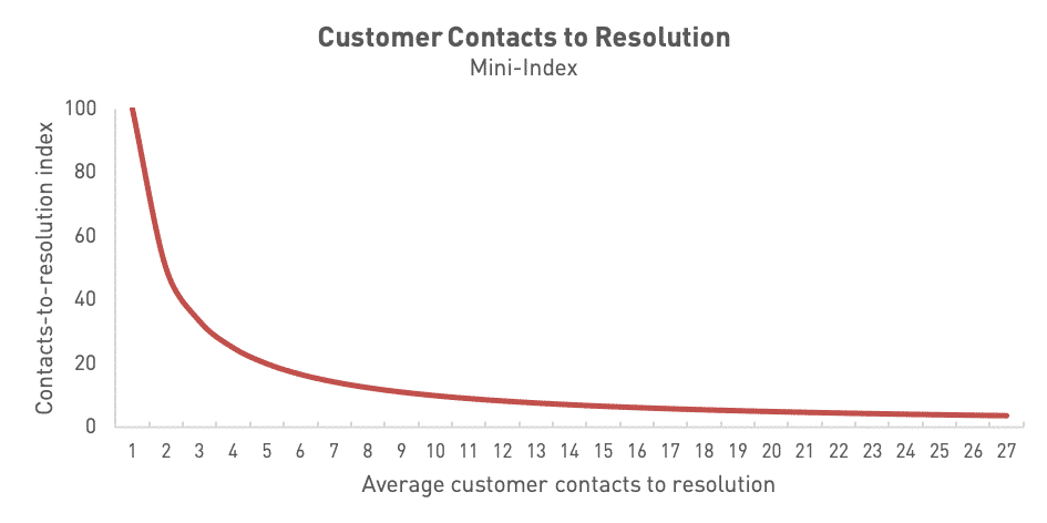
It's exactly what we want because...
- It is now ranged between 0 and 100%, so we can easily mix it with other ranged KPIs
- We get a '100%' score if we resolve every problem on the first customer contact with us
- It gives much more importance to 'early changes', so the change from an average of 1 contact to an average of 2 contacts takes us from 100% to 50% (a decrease of 50%) but moving from 19 to 20 contacts takes the index from 5.26% to 5.00% (a decrease of just 0.26%)
If we aren't getting quite what we want, we can easily tweak the shape of the curve and the axis intercept by tinkering with the maths and coefficients of the graph. In doing this, we have built a 'mini-index' ready to be mixed with the others, to create our finished product.
Preparing to mix 'wrong way up' ingredient KPIs with 'right way up'
Earlier on, you reviewed each of your ingredient KPIs and identified whether they were open-ended / ranged and bigger=better / smaller=better. So, what do you do if one of your ingredient KPIs going up is a good thing and another going up is a bad thing?
You have two options for dealing with this. If your troublesome KPI is 'ranged' (has a maximum and minimum), we could use '100%-measure'. You can also use 1/[KPI], but be very careful - if your [KPI] value tends towards zero (or hits) zero you will get a massive / infinite figure!
Once you have that sorted, double-check that each element of the Index algorithm pushes the overall score in the 'right' directions when each element varies (use the 'Does that make sense?' test).
Sweet spot KPIs
There's a special case in addition to 'bigger=better' and 'smaller=better', and that's what we call a 'sweet spot' measure. This is a measure where you don't want something to be too high or too low.
Our example, shown below, of a sweet spot KPI is Call Handle Rate - we don't want to spend too long on calls (it will dent our productivity) or too little time on calls (our customer service is likely to be weak). Check out the example to see how to handle this.
Customer Service Index Example: Designing the 'mini-indexes' for each 'ingredient KPI'
Looking at each of our four 'ingredient KPIs'...
Number of customer contacts to resolution
This is an open-ended, more is worse KPI. This needs some work. The following relationship turns it into a ranged mini-index which gives a better score for a better outcome (a lower average number of customer contacts required for problem resolution)
[Average number of customer contacts, mini-index] = 1/[Average number of customer contacts]
Call Listening Score
This is a ranged, more is better, KPI already. So it's ready to go as it is.
Customer Feedback Score
This is a ranged, more is better, KPI already. We just need to convert it from a 1-10 score to a percentage.
Contact Handle Rate
This is a sweetspot KPI. Ruby has discovered that the best calls take an average of 10 mins, but between 8 and 12 mins should be fine. Outside of these times, the calls are too rushed or too slow. After some messing about with a graph plotting tool, Ruby develops this chart formula
[Average handle rate, mini-index]=1-(0.005*(x-10)^4
The problem with this formula is that the score decays nicely as the calls take less than 8 mins or more than 12 mins, but can then go negative. This doesn't really do what we want it to. We can fix this though, but using some logic in Excel. Here's the formula that forces the score to zero when the output value becomes negative...
[Average handle rate, mini-index]=IF((1-(0.005*(x-10)^4))<0,"0",(1-(0.005*(x-10)^4)))
Here's what the curve for this looks like when we plug it into Excel...


Figuring out how important each KPI really is to you
Ranking your ingredient KPIs
The best way to decide the weightings, in order of importance are...
- Fundamental physical relationships: We KNOW that density=mass/volume
- Empirical relationships: We don't understand the science, but when the weather goes up 10C we sell 20% more soft drinks
- Opinion: As a group we have agreed that customer service representative hairstyle contributes 20% to customer satisfaction
- Solo decision: I have unilaterally decided that number of web site hits comprises up to 10% of our 'web engagement index'
Customer Service Index Example: Rate ingredient importance
Reviewing each of her 'ingredient KPIs', Ruby decides that none of her KPIs are 'do or die' (although there was a heated debate around 'handle rate') but decided that 'Customer feedback score' was a more important measure than 'Number of customer contacts to resolution', which was more important than the remaining two 'ingredient KPIs'. Here's the ranking...
- Customer Feedback Score
- Number of customer contacts to resolution
- Call Listening Score (joint 3rd)
- Contact Handle Rate (joint 3rd)

Working out the maths of your performance index
Most performance indexes will generally just involve basic arithmetic - addition, subtraction, division and multiplication.
There are a few occasions where the index has to represent a physical relationship and the maths gets very slightly more complicated - for example Body Mass Index (BMI). From experience, it's fairly unusual to have to go beyond basic arithmetic though.
For a performance index to work there needs to be a relationship between the things you are reporting. You could create a performance index that mixes 'the price of fish' with 'the favourite trouser colour of politicians', but it wouldn't be meaningful. Sometimes this will be obvious, where there is a physical relationship between the behaviours and the top level measure - such as fuel efficiency and Eco Score on Toyota cars. In that situation the 'Eco Score' is a leading indicator of fuel economy. If you get that algorithm wrong it will become clear when you get a 'good' Eco Score and poor fuel economy.
In other situations it may not be so clear cut, for instance where you are trying to 'measure staff engagement' or 'customer service'. There will be lagging indicators of the effectiveness of both of these examples but those outcomes are partially determined by outside factors, so it's not completely clear-cut.
Build your first performance index KPI algorithm
Algorithm sounds a bit fancy, but all we are talking about here is creating a step-by-step formula that represents the relationship between the 'ingredients' in our composite measure. Understanding the physical or logical relationship behind our 'ingredient' measures can help hugely. If you are creating something a bit more abstract (like Weight Watcher Points) then you will need to put a bit more thought into how much weighting you put behind certain inputs.

Should it be a multiplier? Is it a critical element to performance?
When you are deciding the arithmetic of your index, you need to ask yourself this question about each of the ingredient KPIs - 'When it 'fails', does it render all the other elements meaningless?'. If the answer is 'yes', then you will multiply the whole expression by this value, so that when it falls to zero the index falls to zero.
- Example: When creating a website performance index, if you have zero website visitors, then every other aspect of website is pretty irrelevant, so you might want to set visitor numbers as a multiplier ([visitor numbers] x [the rest of your index])
Decide how the performance index ingredient KPIs 'mix' together
Earlier on, you considered the logic of how your 'ingredient KPIs' interact. Now you need to express this as a formula.
Different elements have different importance. You can weight each element to contribute to the final score, like this...

The key ways to tweak and control your algorithm are:
A) The big guns in descending order of "amplification"
- Indices (raising something to a power of x). Powerful but risky!
- Division or multiplication to drive the algorithm
- Good ol' addition and subtraction
B) The small guns
- Coefficients - fixed multipliers. The BMI figure is simply the coefficient that allows us to equate kg to height squared, all we did was to rearrange the equation to put the coefficient in the hot seat.
- Correction values - These are offsets to enable us to make things work. If you think back to school, linear charts could be described as y=Mx+c. We are talking about c here.
Strange scenarios and the maths to watch out for
Answers heading to infinity

Anything that is multiplied or divided by anything else can go very screwy at the extreme. Let's say we diving A by B to give answer C.
If A is 5 and B is 10, then C= 0.5
If B heads down to practically zero, let's say 0.000001, our result shoots up to 5,000,000.
As B tends towards zero C tends towards infinity.
Now it may be that answer is a fair reflection of what you are trying to show. More often though, it's the unexpected side effect of the way the index is designed.
Two wrongs making a right
 Let's say we create a measure for 'cooking accuracy' for baking a cake. That measure is for the difference between the weight of each ingredient we put in the cake, compared with the target weights in the recipe.
| Ingredient | Target | Actual | Difference |
|---|---|---|---|
| Flour | 300g | 300g | 0g |
| Sugar | 75g | 70g | -5g |
| Salt | 3g | 8g | +5g |
| Egg | 50g | 50g | 0g |
| Net error | 0g |
If you bake a cake and put 5 grammes too little sugar in it, you do not fix that problem by putting 5 grammes of extra salt in it! A common mistake when designing performance indexes is to encourage the user to do just this. Often, the simplest solution to this issue is to use the 'absolute' variance - i.e. make the difference positive, whether it's a 'plus' or 'minus' deviation.
Customer Service Index Example: Design the maths of your performance index
Ruby decides that she will use her four 'mini indexes', ranged from 0-100, then create an overall weighted index where the 'ingredient indexes' are mixed in the following ratio...
| Mix | Mini-index name |
|---|---|
| 25% | Number of contacts to resolution |
| 20% | Number of contacts to resolution |
| 35% | Number of contacts to resolution |
| 20% | Contact handle rate |
Next, Ruby builds a spreadsheet that mixes the mini-indexes into our final 'Customer Service Index'...
Here's the first part of her performance index model. It's all about clearly explaining each of the steps in the calculation, and the reasoning behind the algorithms chosen...

And here's the second part of the model, with some actual numbers...


Test, tweak and deploy
Once you have your performance index set up, it's time to test it. Most performance indexes work as expected for typical situations but can go very strange in extreme situations - very high or low values for some of the components. Make sure you include some zero values, as these are the ones that can sometimes cause the biggest upsets.
To test the index, set up a spreadsheet with multiple input-value scenarios. Talk through the inputs and resulting scores with the end-users of the index.
For each extreme situation ask the question 'Is the Index value being presented an appropriate and realistic reflection of the impact of that situation?'
Test your prototype performance index with your audience
Take the new measure on a 'road-show' with those who will be creating the measure or using it to drive the business (though it's best to involve them from Step 1, if you can).
An open discussion, with no 'right answer', will be the most effective way of developing acceptance and engagement. Questions that normally get some interesting answers include:
- Do you feel the measure is fair?
- Which situations do you think might give a misleading output?
- How could the measure be better and/or fairer?
Depending on the responses, you may have to go back to Step 4 at this point or you may have done your ground-work correctly and be ready to launch your new shiny index KPI.
Customer Service Index Example: Test, tweak and deploy
Ruby extends the spreadsheet to show several extreme situations, such as...
- Mostly bad: The ranges measures are all the worst they can be and it takes 8 contacts (on average) from the customer to resolve their problem.
- Mostly good: All the ranged measures maxed-out and every customer problem resolved on the first contact by the customer
- Good-bad mixture: Customer problems are resolved on first touch, the call listening scores are the lowest they can be, the customers love their service and the agents take half-an-hour per call (much slower than target). A weird mixture of performance, but worth testing.


Case Study: Real-world Example
How an Index KPI saved my email newsletter... sort of
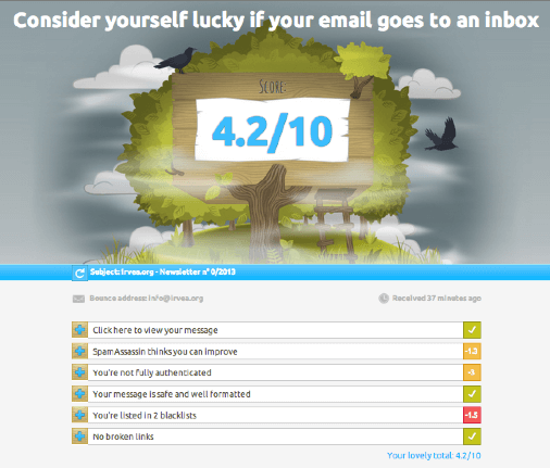
After shying away from sending out a regular newsletter for far too long, I decided to get to grips with my newsletter software a few weeks ago. If you have ever sent out newsletters by email you will know that a serious challenge is getting the email into your subscribers inbox and not blocked by filters. This is a particular challenge as there are SO many ways that your mail can be marked as unwanted, it can get rather overwhelming.
MailPoet have come up with a really nifty solution called Mail-Tester. They have worked out a way of distilling the complex (and really technical) challenge into
- A number
- A picture
- A simple description
Here's the type of feedback you get when you send them a test email...
What makes this so effective is that the overall message is crystal clear, it gives you a quantitive scale that relates to your likelihood of delivery. It also explains this in plain English and adds a picture to really hammer the point home. What makes it so good though, is that it shows you how the score is built up of sub-scores, which parts are causing you issues and what steps you need to take to IMPROVE your score. Here's the type of feedback you get in the score breakdown below...
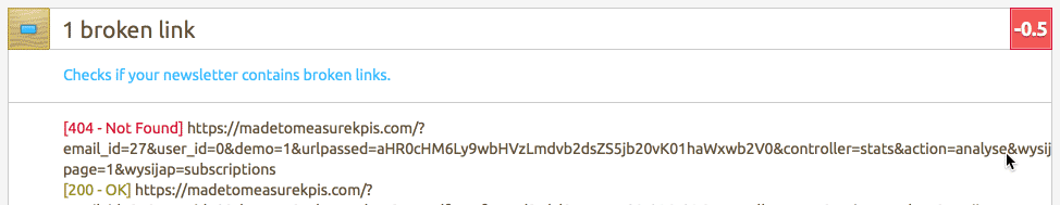
- It shows you how many 'points' you lose per issue, so you instinctively prioritise the 'biggest win'.
- It shows you details of the specific issue, sometimes linking to further advice
- It often suggests ways to fix the problem
Does it work?
And my newsletters? Well, thanks to mail-tester.com I've gone from a rainy cloud, a score of 1.5, and a message saying 'Your email will never see the light of anyone's inbox' through to this....
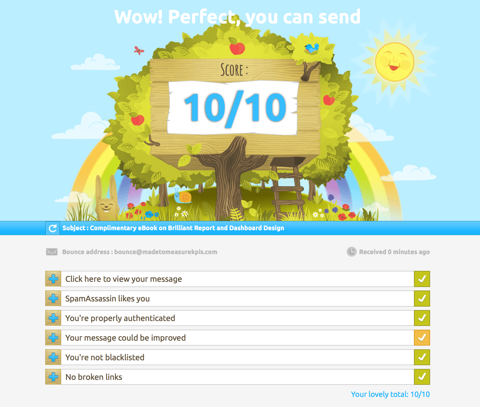
That's great, but a word of warning. Even with a 'perfect 10' my iCloud email STILL treats my emails as junk mail, so perhaps I shouldn't have been quite so trusting of their Mail-Tester's scoring index....
Best Practices in KPI Implementation
First of all, give yourself a well-deserved pat on the back for making it through the entire EPIK-DS! You're well on your way to becoming a KPI hero in your organisation just by understanding what an index KPI is and how to develop one. Let's now turn our attention to a number of areas when it comes to implementing these magical indexes.
What makes a good performance index KPI?
A good performance index KPI should be transparent and balanced.
The index should also...
- Mix together elements that all genuinely contribute to the same measurable outcome ('deliverability' of email in our later example).
- Offer 'at a glance' insight into a complex situation.
- Point the user in the right direction for more detailed analysis of the underlying problems.
- Use 'weightings' on their component parts which accurately reflect the true drivers behind performance.
When should you not use a performance index?
Performance Indexes are fairly blunt instruments. The exact scores varies depending on how they are designed. This means you cannot solely rely on them for 'big' decisions, especially where you are comparing small differences between index scores.
They are good for 'at a glance' assessments, driving behaviour in the right direction and trend analysis.
They can also be badly designed, incorrectly weighted and unrepresentative. If you have any doubts about how the index works, you need to pull it apart, understand how it works and do some deeper analysis of the constituent measures.
Another risk is that you have more than one trend that cancel each other out. Again the only remedy is to look at the underlying trends, not just the index.
Situations where using a performance index might be risky...
- The audience is a casual (or not very sophisticated) audience, so they don't have the time, inclination or ability to understand how the index KPI works
- There is little meaningful causal relationship between the different elements of the index KPI/measures
- The index has not been explained to the target audience, or they don't trust the measure

When performance indexes go wrong: The Bradford Factor
One particularly poor measure I have seen affected by this is the Bradford Factor. It's a dreadful HR measure that supposedly measures workplace disruption caused by sickness (read more about it here - note that no-one has ever found the supposed research that this measure is based on and Bradford Business School have pointedly distanced themselves from any involvement in its creation).
The Bradford Score (a performance index) is determined as B=S² x D, where B is the Bradford score, S is the number of absences and D is the total number of days missed. Let's look at two situations.
Here's an example showing why this is such a terrible index...
- Tim has 20 working days off for a back operation. Bradford score = 20
- Sarah has chronic asthma and has had to take 20 working days off, as half days. Bradford score = 32000
Unfortunately, this wrong-headed measure is being used to make decisions about real people even today.
Making sure your performance index gets used
Let's say you decide to implement what you've learned here today. The last thing we want to see happen after all your hard work and effort is the index KPI falling by the wayside and not getting the attention it deserves from decision makers. Fortunately, there's a simple way to drastically reduce the chances of this happening: get the right people involved.
Invest effort in getting those who will live with the measure into a room and get them bought-in to the composite measure. It is best to do this right from the start as objections (or worse, being ignored) are the biggest challenges you are likely to face with your new index KPI. Here are some pointers to holding a productive discussion to gain buy-in:
- Get the right people in the room for the discussion
- Explain the problem you are trying to solve
- Discuss all the options for tackling this problem
- Develop a shortlist of "ingredient measures" that should go in the index measures - these are the measures that will be used to calculate the index measure.
- Genuinely listen to, and think about, any objections and concerns raised at this point
For some more tips on how to create KPI engagement, read this blog.
Getting your performance index users on-board
 Indexes can be a bit strange and new when people are first exposed to them. Clear explanation is one of the best ways to help people become comfortable with them, along with regular exposure to the output values. A 'KPI Cheatsheet' can be a really effective way of communicating how an index is calculated and can act as a handy reference tool.
Most critically, performance indexes will be used if they are seen as useful.
A Final Thought
Performance indexes are great, but... it can take lots of time and effort to create one, so it's not something you would want to do on a whim. If you do decide to invest that time and effort, you could quickly find that it rapidly becomes a crucial business tool, giving your organisation a serious competitive advantage.
Bookmark this page for future reference and remember to check out our Index KPI Design Course for a more comprehensive learning experience. Good luck with designing your performance indexes and get in touch if you need some practical help.
More questions? Check our our Key Performance Index FAQ page.


