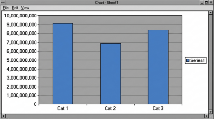
charts
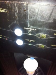
“Compressor on”, how to label your reports more clearly
I just poured myself a cup of water from the water chiller. I noticed that it helpfully offers two temperatures of water and has a little light with “Compressor on” next to it. Why would you put this on a customer facing display? What they really mean is “this water cooler is working and cooling…
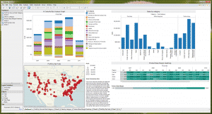
First look – Tableau 6.1, Data Visualisation Software
I spend most of my time with clients trying to get more out of their existing tools, more often than not some combination of an ERP tool (JDEdwards, SAP etc.) a selection of more “pure” databases such as Oracle, Access, SQL and a lot of spreadsheets. All of these tools have well understood strengths and…
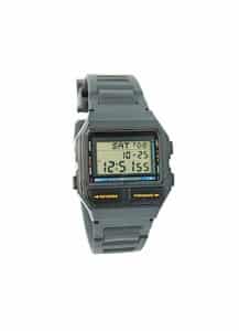
Graphs, your choice of watch and how not to get eaten.
I can still remember how excited I was when, aged 7, I got my first digital watch. It was clear to me that digital watches, with their accuracy and lack of complicated hands, were going to conquer the world. So why am I here 33 years later with an analogue watch? Surprisingly it’s to do…