


Lazy and dull
I’ve just had the pleasure of reviewing an “improved report” for the executive board of a UK company worth many billions of pounds. Now I’m not about to start sharing their confidential data, but most of the graphs looked an awful lot like this:
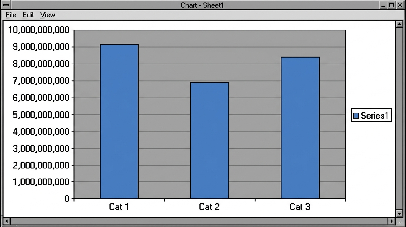
Does it ring any bells? It should for anyone who has been within spitting distance of a corporate PC. It’s a good ol’ default Excel column chart – the one you get when you accept every default setting.
Why does this rattle my cage so much? Am I obsessed by presentation over content? No. My main objection is that using default graphs shows that zero thought has been given to the way in which the data will be read and interpreted. In this example, why would you show the target as a separate bar (apart from the template graph dictating how you show your data)? A small target bar in a different colour, overlaid on the actual, would make far more sense. And where’s the context for the data – specifically a trend?
What the default template gets wrong
- Wasteful use of colour. Why have a grey background? What extra information does it convey? It uses extra toner when you print and adds nothing to understanding.
- Gridlines. If the values are important, why not use a data table as well? Gridlines are extra clutter and add little to accuracy.
- Too many digits on the axis. People are generally poor at coping with big numbers. If you need to deal with something big, deal in thousands or millions as fits – don’t dazzle with 10-digit numbers.
- Borders. More clutter, around the graph area this time. The box adds nothing, so why have it?
- Meaningless colour choices. Why blue bars with a black border line? Colour can be fantastically powerful at steering the eye to important highlights; here it’s doing nothing. Why not make the bars a mid-grey with no border and save colour to pick out specific columns, targets or exceptions?
None of these points sounds significant on its own, but fix them all and you end up with a graph that shows some thought for the reader and some real design.
Next time you need to create a graph, look at each detail on it and ask the simple question: “What does that do for the reader – does it inform or obscure?”
Next steps
- 5 common dashboard design mistakes (and how to fix them)
- Free Excel KPI dashboard templates – professionally designed templates with none of the defaults above
Get practical KPI advice in your inbox
Join the free KPI newsletter for plain-English guides like this one. No fluff, unsubscribe any time.
I’ll only email you the newsletter. Unsubscribe in one click.


")
? Everything You Need to Know")


This struck a chord with me – I’ve never thought how offended I am by poor graphs, but reading your observations made so much sense. Next time I have to sit through another dull presentation I’ll track how many of these simple errors people make.
(I found your blog via the weekly LinkedIn updates)
Bernie, also read this excellent piece regarding the brilliant Edward Tufte: https://www.excelcharts.com/blog/can-edward-tufte-do-business-charts/
And if you don’t own this https://www.amazon.co.uk/Visual-Display-Quantitative-Information/dp/0961392142/ref=sr_1_1?ie=UTF8&qid=1288718108&sr=8-1, I assure you it’s worth the price for the train timetable on the front, alone.
Emma