





Month: September 2018
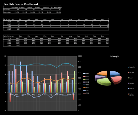
5 Common Dashboard Design Mistakes (and How to Fix Them)
How many of us have been here: you’ve spent hours building a dashboard. You’ve pulled in all the latest numbers, added data visualisation, polished it up, and shared it with your team. And then… chaos. Stakeholders are firing questions left, right, and centre: “Wait, what does this chart mean?” “Why is this important?” “Are we…

How to avoid this common Excel disaster…
On 4 January 2010, in the Marriott hotel in Atlanta, two giants in the world of economics, Prof Carmen Reinhart and former chief economist of the International Monetary Fund, Ken Rogoff, were presenting their research paper, ‘Growth in a Time of Debt’. Their message from their research turned the heads of global leaders and pushed…
Did an Excel mistake cripple the world economy?
On 4 January 2010, in the Marriott hotel in Atlanta, two giants in the world of economics, Prof Carmen Reinhart and former chief economist of the International Monetary Fund, Ken Rogoff, were presenting their research paper, ‘Growth in a Time of Debt’. The headline message was clear and head-turning… When the size of the country’s…
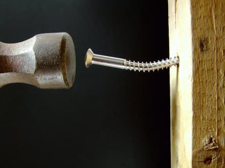
The worst Excel user ever?
At the start of my career, I worked with someone who used to moan ALL the time about how terrible Excel was. After weeks of complaints, I decided to see if I could help, just to stop the complaining. I sat down next to him and quickly discovered he was using the ‘shapes and lines’…