How to avoid this common Excel disaster…
On 4 January 2010, in the Marriott hotel in Atlanta, two giants in the world of economics, Prof Carmen Reinhart and former chief economist of the International Monetary Fund, Ken Rogoff, were presenting their research paper, ‘Growth in a Time of Debt’. Their message from their research turned the heads of global leaders and pushed policy towards 'austerity' around the world, following the crash of 2009.
But there was a catch...
There were several basic errors in the spreadsheet that underpinned their work. A 28-year-old graduate student called Thomas Herndon uncovered these mistakes.

Among these mistakes, Reinhart and Rogoff had accidentally missed out 5 of the 20 countries in their calculation of average GDP growth of countries with high public debt (the countries were listed but the formula didn’t include the data for those countries). The countries they had missed were Australia, Austria, Belgium, Canada and Denmark.
How had they missed those five countries? The had simply failed to select the full range of data they needed to include when setting up their formulas.
How to stop this happening to you
This is a surprisingly common problem, especially on chart ranges. The good news? There is a way to dramatically reduce the risk: Separate raw data, variables (like date) and analysis, then use a central variable to select the right data for you.
Here's how you do it...
Firstly, create separate tabs for...
Variables, like 'date'. This means you can go to one place to set things, instead of jumping around a whole workbook to change things. To make it even easier, use a colour convention - I use light yellow = data entry here, light green = don't touch this.
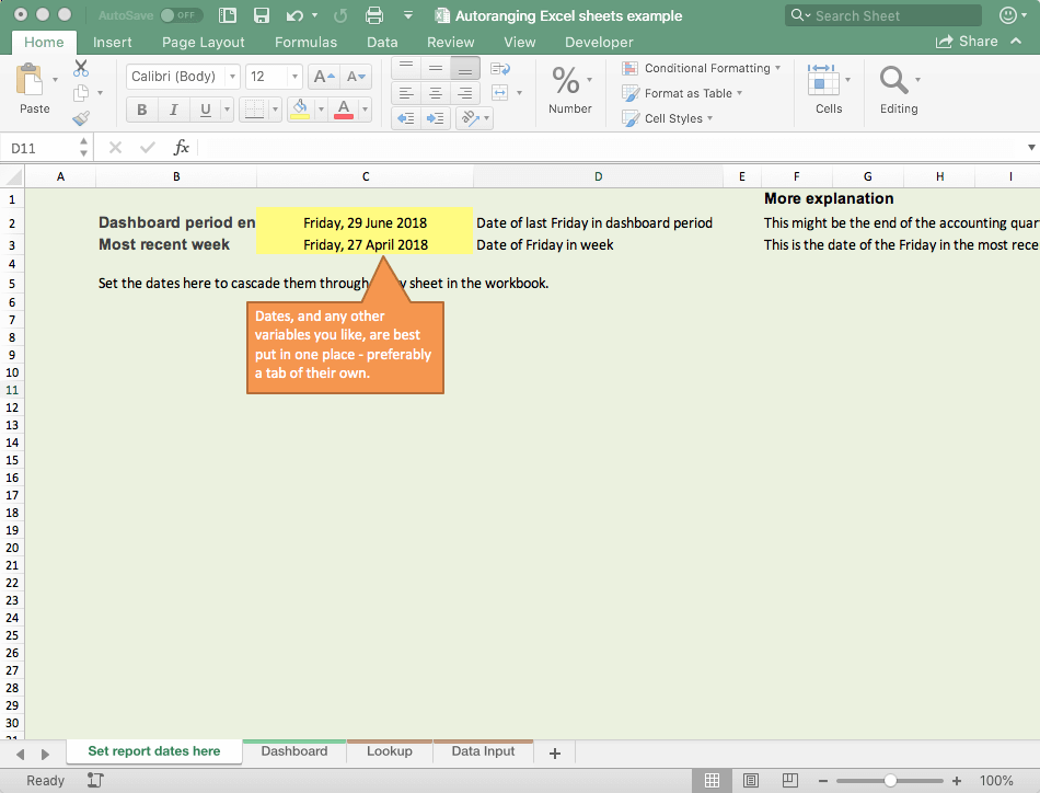
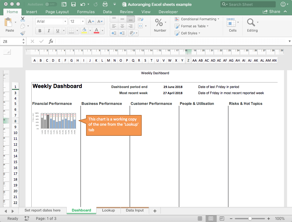
Dashboard. You will usually be gathering charts together in one place. Have a separate tab to do this. Generally you will never make any regular changes to this, unless you are having a re-design or are making improvements.
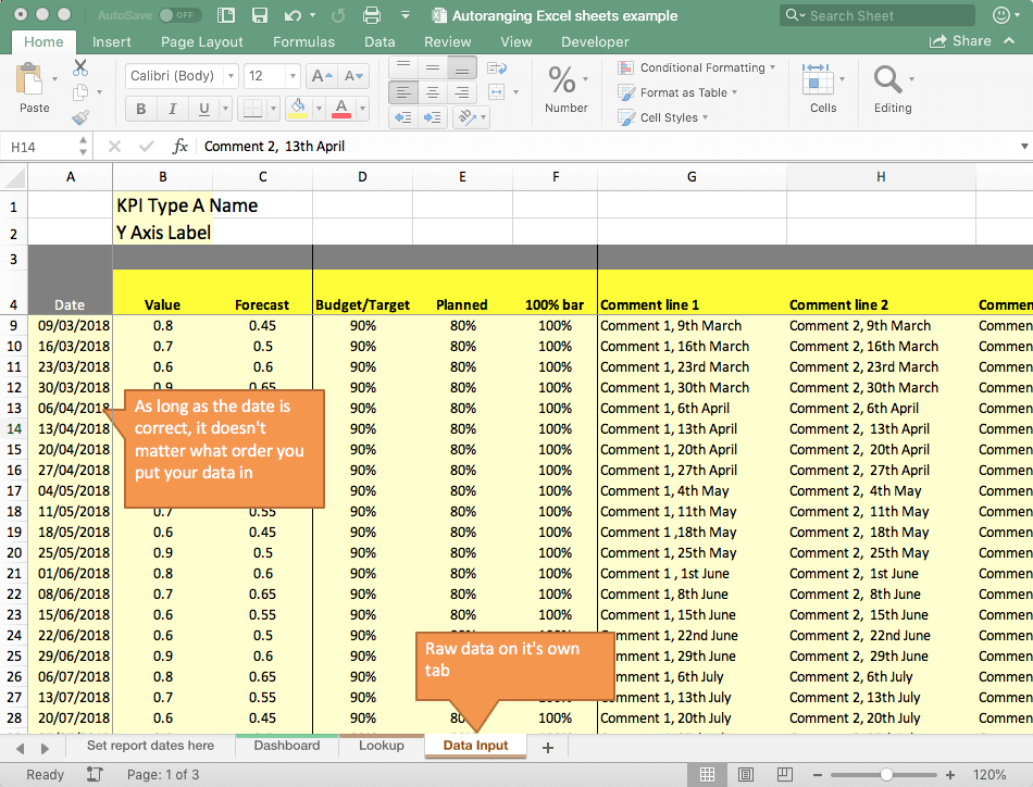
Raw data. Here you add your data in a 'bottomless list'. As long as there's a date, or other information you want to report by, then we will sort out the data selection and sorting in the 'Lookup' tab, using the 'date' or anything else you decide to use on the x-axis.
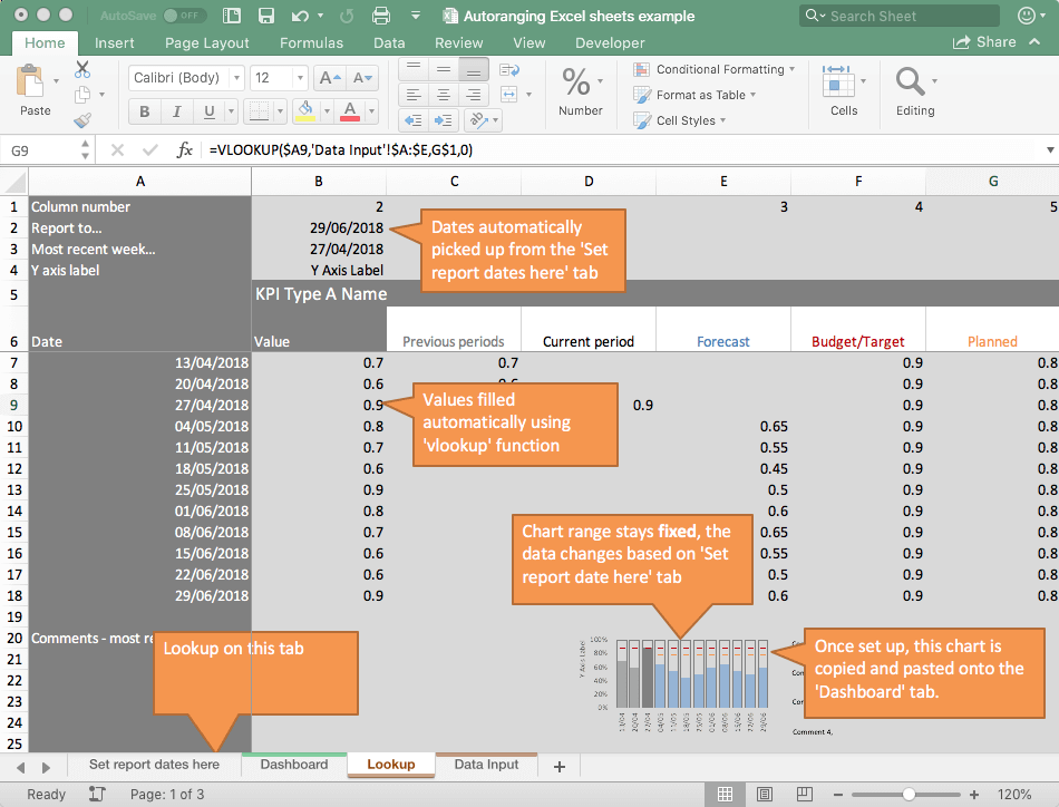
Lookup. This tab uses the date you set on the 'variables' tab, creates a date range (e.g the month of the date you entered and the previous 12 weeks, as in this example) and then looks up the data for those dates.
Next...
Use vlookup to automatically find the right data points from your 'Raw data' tab and fill in the table that you will use for your chart on the 'Lookup' tab. When you have this working properly, you will be able to change the date on the 'Set report dates here' tab and the fields on your 'Lookup' tab will automatically update.
Once you have a working table, you need to select the data range and build your chart. Try and keep the chart clutter to a bare minimum.
When you are happy with your chart make a copy and paste it into the dashboard (here's a tip on lining them up nicely).
Test your new self-ranging chart(s) by putting some dummy data into your 'Data input' tab. Put a step change in the raw data and make sure the chart reflects the step change in the right period.
You should now have a setup where you can throw new data onto the 'Raw data' tab, set the report date on the 'Set report dates here' and your charts will now automatically sort themselves out.
Why jump through all these hoops? It looks a bit hard!
This may look like a lot of hassle, but there are two major benefits to doing it this way. It...
- Sets you up for growth. It's easy to handle 40-50 or more sets of data and charts using this approach.
- Requires zero maintenance. Once you are set up, you can protect any parts that shouldn't be tinkered with, and then it's just a case of adding data to the Raw data tabs and setting the 'Report to date' on the 'Variables' tab.
Here's a helping hand...
It can be a bit of a chore to set up, so I've created a demo sheet. Signup below for an instant download.
Get the demo sheet in a free download!

We will use your email address to...
- Send you a link to the free sample sheet you have requested, so you can download it in future
- Send you our 'Made to Measure KPIs' newsletter
We will never share your details with third parties. You are free to unsubscribe from our newsletter at any point (unsubscribe link included in every email).
If you would like a complete, pre-built, dashboard template kit, with everything set up this way to turbo-charge your dashboard building - check out the Brilliant Excel Dashboards Kit...


