


report design

Assessing Report Design Objectively – Avoiding Fights
There are three situations where it can be a good idea to have a structured review of your reports and dashboards… If some of your team are in denial about the need to change existing reports You want some clear ideas on what needs to be included in improved dashboards or reports You have an…

Dashboard design – lessons from Britains ‘lost bomber’
Part of being a geek includes dragging your family round aircraft museums. Wandering round the Imperial War Museum in Duxford last week I came across an impressive looking failure – the TSR2. Britain, like many wealthy countries, has a long and grizzly history of defence projects going wrong. The TSR2 was envisioned initially as a…

KPI Report Design – Using Science to Improve Readability
Using brain science to design better reports and dashboards The challenge with dashboards is that we are trying to convey an insanely large amount of information in a very small space. A dashboard I built for a client a couple of years ago had nearly 2,000 pieces of information on an A3 sheet. To be…
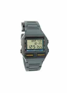
Graphs, your choice of watch and how not to get eaten.
I can still remember how excited I was when, aged 7, I got my first digital watch. It was clear to me that digital watches, with their accuracy and lack of complicated hands, were going to conquer the world. So why am I here 33 years later with an analogue watch? Surprisingly it’s to do…