Assessing Report Design Objectively – Avoiding Fights
There are three situations where it can be a good idea to have a structured review of your reports and dashboards…
- If some of your team are in denial about the need to change existing reports
- You want some clear ideas on what needs to be included in improved dashboards or reports
- You have an innate masochistic tendencies
Whatever your reason for reviewing your reporting, assessing report design objectively helps take (some) of the emotion out of the process. A structured approach enables easy comparison of the performance of different reports in a consistent way.
The following design checklist encourages you to consider each element of your design and to score it. You can use the score to objectively show the improvement to a document (although ultimately this is a subjective thing). It is pretty long, at 53 questions, but it does cover most areas of design. With practice you will probably not need to refer to this list but it can be a useful memory jogger. It gives a semi-objective framework that can take some of the emotion out of critiquing existing dashboards and reports.
Review existing reports and dashboards – The Brilliant Dashboards Scorecard
Question scoring: 1=poor, 5=good
Visual design
- Is colour used to convey additional information?
- Are colours used consistently for the same meaning?
- Is a consistent design theme used for all charts and text boxes?
- Are there unnecessary boxes and dividers?
- Do dividers and boxes lead the eye in a helpful way?
- With RAG (red-amber-green ‘traffic light’) indicators, is it clear what criteria are used for RAG?
- Are there unnecessary tick marks?
- Are there unnecessary borders on chart areas?
- Is the background unnecessarily shaded?
- Are the columns/bars unnecessarily shaded?
- Are there unnecessary borders on columns?
Layout
- Are text and chart size proportionate to the importance of the information being conveyed?
- Are data points that need comparison near to each other?
- Are logos and ornamentation kept to a bare minimum?
- Is spacing consistent and pleasing?
- Are lines used to guide the eye in a meaningful direction?
- Is there a ‘logical hierarchy’ for text and comments?
Structure
- Are there large amounts of numbers that need to be read to understand the high-level situation?
- Can you quickly navigate to the section of the report you need?
- Is it clear where the biggest issues are and how to navigate to find more information?
- Are targets clearly different from data sets?
Charts
- Do the graphs and charts meet your objectives?
- Are the charts intuitive i.e. no need for careful study or explanation?
- Do the charts have impact and give insight? Do the charts allow meaningful comparison of relevant data sets?
- Do charts clearly show patterns and trends?
- Does understanding the document tax your short-term memory too much?
- Do your eyes have to leap about the page to understand the document?
- Do the charts answer an obvious question?
- If the chart uses 3D, is 3D actually required to represent the information?
- Is the message clear?
Axes
- Are the axes ‘fair’ and labelled? Unfair axes might include logarithmic axes that are not clearly indicated or axes that are not clearly marked as starting from a value other than zero.
- Are the fonts clear, the right size and readable?
- If you use a double axis, is it required to make a valid point?
Labelling
- Are all charts clearly labelled, avoiding jargon or acronyms?
- Is it clear what period the charts refer to?
- Are labels physically near to the things they are describing?
- If unavoidable, is jargon defined?
- Is the level of labelling appropriate or is it obscuring the chart (or the message)?
- Are numbers on the chart given to realistic precision (i.e. not to 5 decimal places if that precision is inappropriate for the accuracy of the source data)?
Trending
- Is there meaningful trending?
- Are gridlines aiding or obscuring clarity?
- Is there unhelpful use of colour and area/fill patterns?
Text
- Is the text relevant?
- Is the text concise?
- Is the text spelled correctly and without grammatical errors?
- Is it clear with which graph any text is associated?
- Is any additional text clear, the right size and readable?
Visual clarity
- Is the document (and its sub-elements) an optimal size?
- Does the layout work for the delivery medium?
E.g. a smartphone, iPad or projector? - Do any of your intended audience have eyesight issues? If so, is the output of suitable size, colour and contrast?
Other points on appearance and readability
- It is possible to understand the general message ‘at a glance’?
- Is it clear who created the report and contents?
- Is it clear who to talk to if there’s a query or correction and how to contact them?
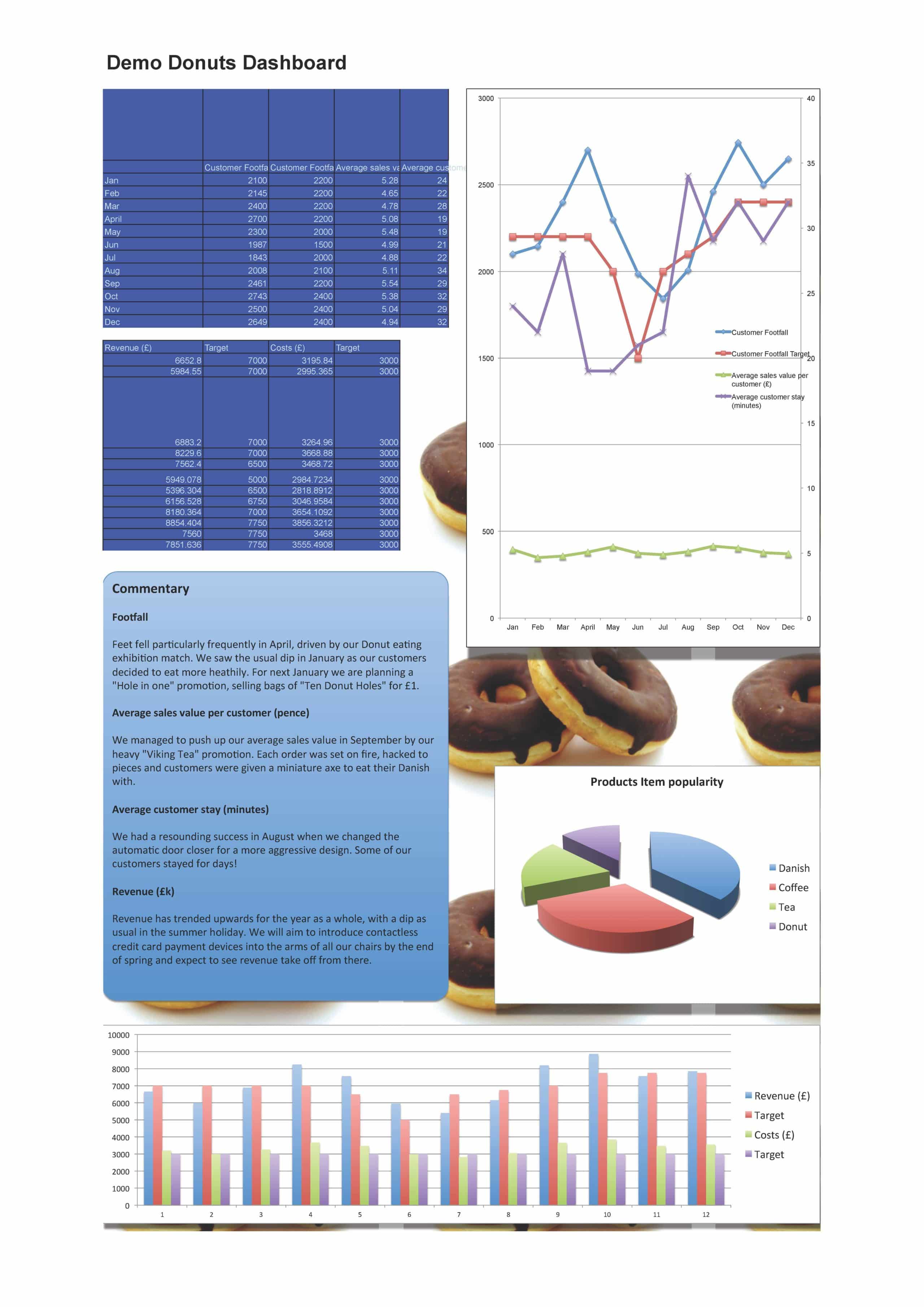
Below is a truly dreadful sample dashboard. Try running through the set of questions above. You should find that your are able itemise the main problems with the dashboard in an objective way.
In the next image you can see the same data reworked using the ‘BlinkReporting’ approach (the checklist and examples are from my book of the same name).
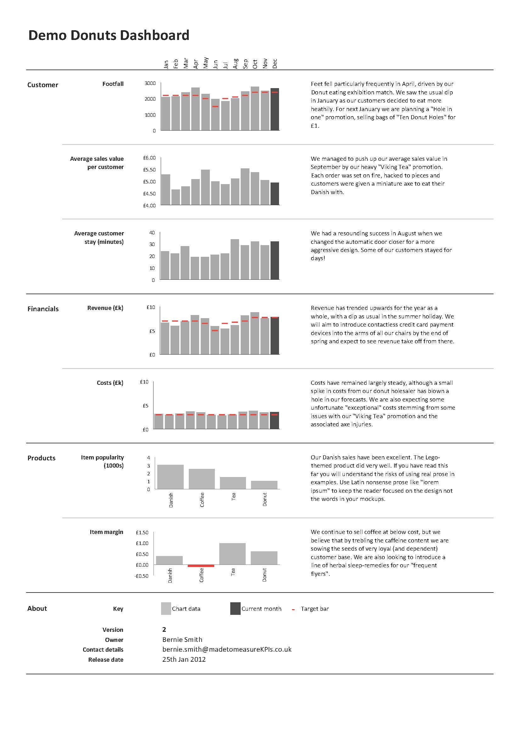
The example may not be very ‘pretty’, but my clients have told me over and over that this style becomes very clear and easy to understand – particularly with familiarity.