KPI Report Design – Using Science to Improve Readability
Using brain science to design better reports and dashboards
The challenge with dashboards is that we are trying to convey an insanely large amount of information in a very small space. A dashboard I built for a client a couple of years ago had nearly 2,000 pieces of information on an A3 sheet. To be able to transmit this amount of information without completely overwhelming the reader we need to use some techniques based on an understanding of the way that humans process information. Most of this will be common sense, although some of it may be new to you.
Too much for our primitive brains
The challenge is that our brains are designed for hunting, gathering and not getting eaten. We are now trying to use those brains to assimilate the kind of information we weren’t really designed for. However some of those legacy attributes can really help with dashboard design.
We see with our brain
The key thing to remember is that we see with our brains not just our eyes. Yes, the eye transmits a signal but it’s the brain that makes sense of it. For the data to be processed we need to not just see it, our brain needs to focus on it and subject it to conscious thought. It is only when we pay attention to the information that it stands any chance of being processed or stored. It’s a bit of a safety mechanism that makes sure our brains are not overwhelmed.
Memory is crucial
Memory plays a really key part in understanding. And I’m not just talking about the type of memory that enables you to know Great Aunt Mabel’s phone number without looking on your phone. There are at least 3 types of memory and it’s probably worth just recapping what these are and why they are important.
- Long-term memory
- Short-term memory
- Very short-term memory or “Iconic memory”
 Long-term memory
This is the type of memory that enables you to remember names, what your phone number is or that nasty scrape to your knee when you were six. This is the type of memory that most people think of when you talk about “recall”. It can be very useful but your brain jealously guards this capacity. Something normally needs to be either very dramatic or repeated frequently to be filed away in this valuable part of your brain.
..and why long-term memory is important for reports
For dashboard and KPI report design purposes this type of memory is really important when it comes to layout. If you frequently visit the same website or read the same newspaper you will just “know” where things are on the page. You do not have to hunt around to find what you’re looking for. It’s just the same when you get in your car and you know where the indicator stalk is (try getting in a car with the stalk on a different side from the one you’re used to and you’ll know what I mean!). So for our designs we need to respect and treasure the reader’s long-term memory. Consistency in layout and familiarity of key positional details is absolutely crucial to making reports readable and accessible. Interestingly, until it becomes familiar and easy for them, this constancy will not be apparent to the user.
Short-term memory
Short-term memory is the kind of memory that enables you to remember what drinks you’re ordering at a bar, which hotel room you’re in or recall what was in the news. It’s a kind of short-term holding area. It is sometimes called “active memory”. It can be very useful for comparing a few figures or “chunks of information”. Unfortunately research shows that we can only remember between 5 and 9 chunks of information simultaneously. We typically hold things in short-term memory for 20-30 seconds, although we can extend this through reactivation of the memory. This reactivation is called “covert rehearsal”. Reactivation prevents neural endocytosis, keeping the memory alive for longer than the 20-30 seconds that is typical of short-term memory (clearly essential for remembering which hotel room you are in!).
Most people’s short-term memory is terrible!
Why the term “chunk” can help us
The good news is that the term “chunk” is quite elastic. A chunk can be a number but it can also be a shape or line. Now this is good news because obviously a chart line can give a lot more insight than a single number. So one of the key principles (tricks) with dashboard design is to lump as much information into a chunk as we can in a meaningful way. This means “no” to endless data tables and “yes” to simple, streamlined, stripped-down charts in our KPI reports.
 What about those “Report-reading super-humans” I work with?
Given that it is quite difficult to know exactly how capable someone is at extracting the key messages from a dashboard, we have a responsibility to make and design them to be usable by the average individual and not expect super-human powers of data analysis.
Very short-term “Iconic Memory”
Now iconic memory may not even sound like memory to you. It’s probably easier to show you an example rather than described with lots of words. Give yourself 60 seconds and see how many 8s you can spot in this example:
How many did you spot? How confident are you in your answer?
Now try the same exercise again, click on the arrow icon below. Try counting the number of 8s again. Close the image window when you have done this.
Visual Encoding
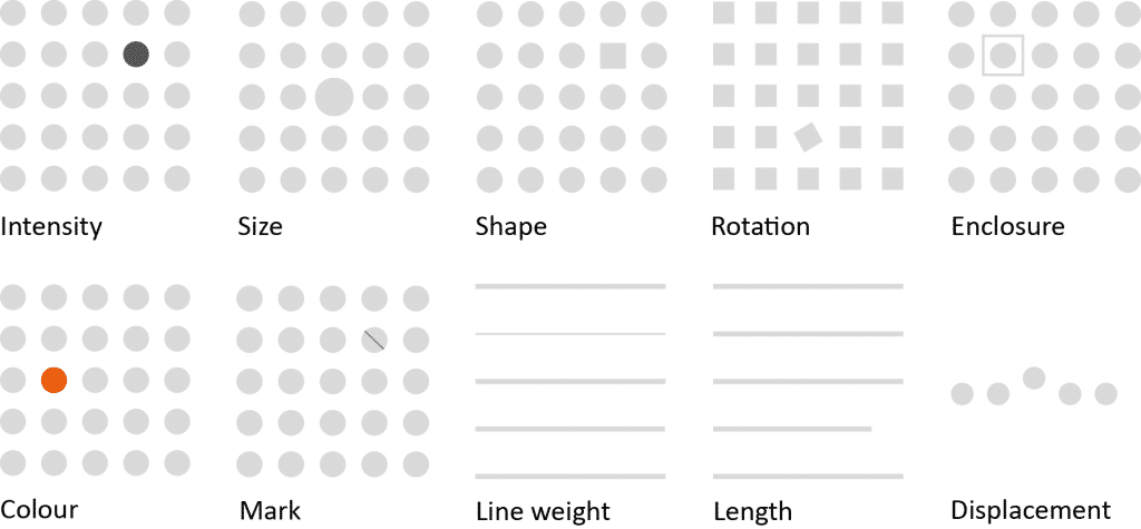
The technique you have just seen is the application of “visual encoding”. Visual encoding is the tool by which you encode specific information in a visual way. Humans are designed to react to visual information extremely quickly. The good news for our dashboard design is that there are a number of visual encoding methods we can use. If we choose carefully we can use several of them at the same time. Let’s have a look at some of the techniques by category. The following categories are based on those devised by Colin Ware in his book “Information Visualization: Perception for Design.
It’s the kind of instantaneous reaction that our prehistoric ancestors absolutely relied on to stop them being eaten and to be successful hunters when they were out and about on the Savannah. It is very, very quick. It is this kind of instantaneous understanding that we seek to use in BlinkReporting. It can enable the reader to instantaneously understand the situation without going through laboured reading and interpretation. The more of this kind of reaction we can use the less fatigued the reader will be, and the faster they will gain understanding from the dashboard report they are looking at.
Every time the reader has to stop and think they are slowed down and fatigued. At some point a reader who is taxed too heavily will give up or end up with a partial understanding of the information in front of them.
There are a number of different ways of conveying information in a way that uses iconic memory. The example above shows just a few of them; if you want the full list see Stephen Few’s excellent book “Information Dashboard Design” referred to earlier.
Crying Wolf and visual encoding
Iconic memory is an involuntary response to visual stimulus. If you use too many of these visual cues at the same time, without conveying information, you will overload the reader. A bit like the boy who “cried wolf”, the end effect is to dull the reader’s response. It reduces the effectiveness of the reader’s iconic memory. Put simply “if it doesn’t need to be there, take it out!”. This includes unnecessary borders, colours, logos and gridlines.
Recap
Long-term memory
- Long-term memory takes time to build. You must use consistent design and layout if you want to exploit the long-term memory of the reader.
- Long-term memory is closely linked to geographical position.
- Long-term memory can help build familiarity with layout and location of information.
- It is generally not possible to rely on long-term memory for anything other than information position.
Short-term memory
- We can typically only hold 5-9 “chunks” of information in our short-term memory unless specially trained.
- A chunk can be a number or a line on a chart. We should pack as much insight into a chunk as possible.
- It is very easy to overload a reader’s short-term memory.
Iconic memory
- Iconic is the very fast “blink” response to visual cues. We need to use it whenever we can.
- Triggering iconic memory is fast and very easy on the reader. It reduces the effort required to read a report.
- We should aim to use “Iconic” memory rather than short-term memory.
- There are a number of different visual encoding methods we can use to spark iconic memory.
- Remove visual and data clutter to avoid blotting out the key encoding methods.


I think we are also dealing with more data than ever before. Each tool collects and gathers just a bit more that we have to decipher to achieve better results.