Prototyping Dashboards – The Five Steps to Success
Why prototype?
It is quite rare to find a client (internal or external) who knows precisely what they want from a dashboard or report. If you catch them with no preparation they will normally reach for an existing report and tell you which bits they want changing and moving. Sometimes this ends with them sighing in a frustrated way as they realise just how far from ‘ideal’ the current report is and they become overwhelmed by the scale of the challenge.
The solution is to create prototypes collaboratively with your internal customer. This takes some care and thought as they are not usually report design specialists.
What is prototyping?
Prototyping means building non-working or partially working examples of the end product – reports and dashboards in your case. Doing this can avoid massive amounts of wasted effort. Even with a good prototype process you may go through 5-10 design iterations. If you build and modify fully working reports over every ite
ration it can take a long time and waste large amounts of developer/analyst resource (and it’s not much fun either).
Even prototyping needs some groundwork to be done. I have discovered that, in some situations, the current poor report design was a direct result of the design choices made in the prototyping session. To avoid repeating the same mistakes you need to agree some good design principles. To make this work the principles need to be backed up by some real science and research.
How to prototype dashboards and reports
Stage 1: Discuss and agree the principles of good design
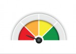
Make sure that you won’t be proposing Sparklines (the most simplified type of graph there is) and utter minimalism when your client is craving multi-coloured backgrounds and painstakingly rendered gauge widgets like this:
This is a tricky conversation as many senior clients have strong views on this. It’s best to stick to evidence. Fortunately there’s lots of evidence to say that extreme restraint in the presentation of data leads to better understanding. To look at this in much more depth you could also read BlinkReporting, my book on exactly this topic.
Stage 2: Watch how
the current reports and dashboards are really used
Observation will normally give you good insight into how people currently use information (if at all):
- Ask people how they currently use their reports.
- Sit in on the relevant meetings and watch how they are actually used.
- Look for any differences between what you observed and what you were told.
If there are big differences then proceed with caution. It suggests there is a ‘reality gap’, which may mean that your final product succumbs to the same fate as the previous report or dashboard. It may be that you are seeing a behavioural rather than a reporting issue here. With behavioural problems, changing the documentation will not fix the underlying problems.
Stage 3: Create design options

There are three basic approaches used in prototyping:
Option 1: Create a number of versions ‘off-line’ and present them to your key decision-makers.
This is the lowest risk, but also the slowest. If you have a customer who is prone to changing his mind or likes a lot of options it can be easy to get bogged down with this approach.
Option 2: Build a dashboard in a live collaborative session with your key decision-makers.
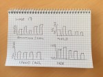
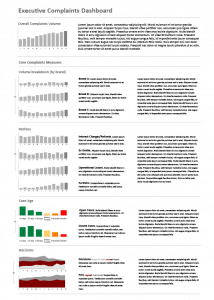
Live sessions work well if you have a patient decision-maker who is happy to get involved. You will also need to be very proficient in your chosen prototyping tool (Visio or Excel, for example). Often building a template or stencil, specific to your purpose, can speed things up. I have a set of stock charts – in my preferred presentational style – with dummy data ranges, set up for prototyping sessions. I also have an Excel data sheet with dummy data ranges showing a variety of trends with realistic scatter. This type of session takes time and is sensitive to IT issues, so make sure you are set up properly and have a contingency plan in case things go wrong (like a projector bulb blowing) – even if it’s just a whiteboard, markers and a camera phone.

Option 3: Use the first approach to create some options then hold a live session to adjust and tune them.
This is the approach I prefer to use. You present some pre-prepared designs, but tune and tweak them with the decision-maker in a session. This seems to achieve the best balance between efficient time usage and rapid design prototyping.
Stage 4 (optional): Review and score existing reports and dashboards
Option 1: Create a number of versions ‘off-line’ and present them to your key decision-makers.
This is the lowest risk, but also the slowest. If you have a customer who is prone to changing his mind or likes a lot of options it can be easy to get bogged down with this approach.
Option 2: Build a dashboard in a live collaborative session with your key decision-makers.
Live sessions work well if you have a patient decision-maker who is happy to get involved. You will also need to be very proficient in your chosen prototyping tool (Visio or Excel, for example). Often building a template or stencil, specific to your purpose, can speed things up. I have a set of stock charts – in my preferred presentational style – with dummy data ranges, set up for prototyping sessions. I also have an Excel data sheet with dummy data ranges showing a variety of trends with realistic scatter. This type of session takes time and is sensitive to IT issues, so make sure you are set up properly and have a contingency plan in case things go wrong (like a projector bulb blowing) – even if it’s just a whiteboard, markers and a camera phone.
Option 3: Use the first approach to create some options then hold a live session to adjust and tune them.
This is the approach I prefer to use. You present some pre-prepared designs, but tune and tweak them with the decision-maker in a session. This seems to achieve the best balance between efficient time usage and rapid design prototyping.
If there is disagreement over the quality of the existing reports and documentation, a good way to assess the current quality is to use a design review checklist. It can take some of the emotion out of the discussion and help build consensus on the need for action. It is best to run a training session on design principles first.
If running a training session is not possible then reading a good book is the next best thing. Of course, I’d recommend my book – Build Brilliant Excel Dashboards, but I would also take the time to read Stephen Few’s book ‘Information Dashboard Design’. If you want something a bit broader, but more academic, then take a look a Edward Tufte’s classic text ‘The Visual Display of Quantitative Information’.
Once you have run the training, encourage some key stakeholders to critique their own reports. I will often use client-specific examples during the training (just take care not to cause too much embarrassment).


