





Report Your KPIs

How to keep your reports short and effective
Which is the easier question to answer?: “Tell me about France” or, “Tell me about the restaurants in the village of Venosc that serve Italian food” ? It’s very obviously the latter (assuming you have the information available in the first place). It’s the difference between these two questions that explains how some reports can be…
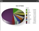
First look – Qlikview Review – Version 10 Personal Edition
As promised in my last “first look” review, I’m taking Qlikview 10 for a spin. For those of you not familiar with Qlickview it’s a data visualization tool that’s designed to make the creation of ad-hoc reports and dashboards, from existing data, quick and simple. Installation Getting hold of Qlikview is a matter of registering…

Spooks, Star Trek and KPIs
Like 4.6 million other people, I enjoy Spooks. I do find myself wincing a bit when Harry, or whoever, makes completely random requests of his spy geeks and they always come up with the goods – you know the kind of thing – “can you cross reference that train ticket with his gardening bill and…
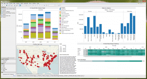
First look – Tableau 6.1, Data Visualisation Software
I spend most of my time with clients trying to get more out of their existing tools, more often than not some combination of an ERP tool (JDEdwards, SAP etc.) a selection of more “pure” databases such as Oracle, Access, SQL and a lot of spreadsheets. All of these tools have well understood strengths and…
Data Analysis – 10 Point Checklist
How good is your organisation at analysing the data you produce? Carefully answer these questions (you can use a 1-5 scale to improve the resolution of the checklist, where 1 is low/poor and 5 is high/strong). Are data and reports separate entities? Does revision of reports require manual intervention? Is there flexibility in cutting data…
Who needs computers?
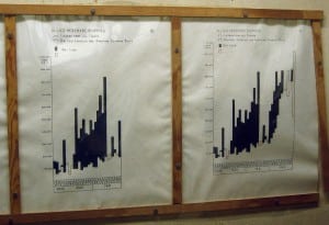
I was in the Cabinet War Rooms a little while ago (the bunker where Churchill ran his WWII operations – for anyone not familiar). Something that struck me was the universal use of really clear, concise and well thought out charts, graphs and maps. Here’s a shot of one: The key on this graph…
Why my phone bill is brilliant.
I’ve just had a bill through from Virgin. It’s not often I find myself smiling when I look at a bill, but this one was a bit different. Virgin have redesigned the bill and put a nice explanation in there as well, see this image (click on it for a bigger version).. I like this…
BlinkCharts, what they are and why you need them
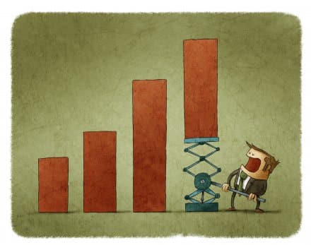
A bog standard Excel chart/graph Most people just use the default graphs on Excel, perhaps with a colour change or two. Who says that Microsoft knows how much detail to put on your graphs? The default graphs (or charts, if you speak Microsoft English) are jam-packed with clutter. Why should you care? Every piece of…

Do You Work for an Idiot?
Here is a process improvement idea for you. It is called “poke yoke”. I am told that that is Japanese for “making things easy to get right and difficult to get wrong”. It is a rather grand name for what my old boss used to call “idiot proofing”. Let me give you an example: think…
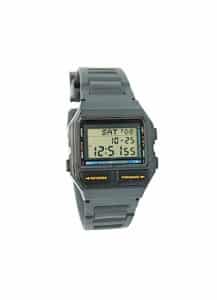
Graphs, your choice of watch and how not to get eaten.
I can still remember how excited I was when, aged 7, I got my first digital watch. It was clear to me that digital watches, with their accuracy and lack of complicated hands, were going to conquer the world. So why am I here 33 years later with an analogue watch? Surprisingly it’s to do…
- « Previous
- 1
- 2
- 3
- 4
- Next »