


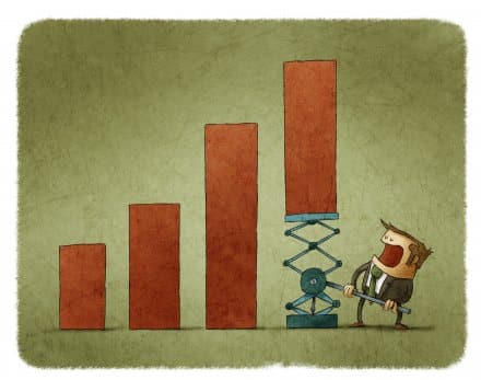
Report Your KPIs
Do the “blink” test on your reports
Review your reporting, can you tell at a glance how your business is performing? Can you (and the rest of your team) easily tell how your organisation is doing, even after coming back from holiday? If you can’t, consider designing a report template and making things visual, with more charts and performance icons. Here is…

KPI Report Design – Using Science to Improve Readability
Using brain science to design better reports and dashboards The challenge with dashboards is that we are trying to convey an insanely large amount of information in a very small space. A dashboard I built for a client a couple of years ago had nearly 2,000 pieces of information on an A3 sheet. To be…

Dashboard? That’s just a posh name for a report, isn’t it?
I had an interesting conversation with a company lawyer a little while ago. We were discussing dashboards and she said “It makes me laugh when people talk about dashboards, it is just a posh way of describing a report!”. It made me think as it seems to be a common misconception. What is the difference between…

How to keep your reports short and effective
Which is the easier question to answer?: “Tell me about France” or, “Tell me about the restaurants in the village of Venosc that serve Italian food” ? It’s very obviously the latter (assuming you have the information available in the first place). It’s the difference between these two questions that explains how some reports can be…
Data Analysis – 10 Point Checklist
How good is your organisation at analysing the data you produce? Carefully answer these questions (you can use a 1-5 scale to improve the resolution of the checklist, where 1 is low/poor and 5 is high/strong). Are data and reports separate entities? Does revision of reports require manual intervention? Is there flexibility in cutting data…
BlinkCharts, what they are and why you need them
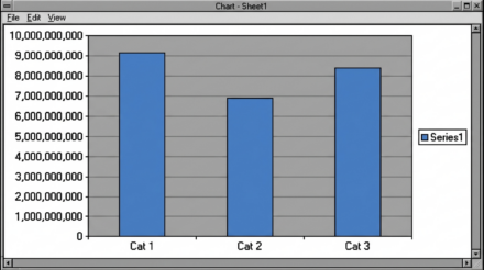
A bog standard Excel chart/graph Most people just use the default graphs on Excel, perhaps with a colour change or two. Who says that Microsoft knows how much detail to put on your graphs? The default graphs (or charts, if you speak Microsoft English) are jam-packed with clutter. Why should you care? Every piece of…
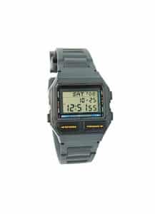
Graphs, your choice of watch and how not to get eaten.
I can still remember how excited I was when, aged 7, I got my first digital watch. It was clear to me that digital watches, with their accuracy and lack of complicated hands, were going to conquer the world. So why am I here 33 years later with an analogue watch? Surprisingly it’s to do…
- « Previous
- 1
- 2