


What is a Key Performance Index (Index KPI)? A Guide with Examples
If you're juggling loads of KPIs and trying to keep your strategy on track, you've probably hit this moment: Do we really need to monitor all of these?
The answer? Not always. That’s where the key performance index, also known as an index KPI, comes in.
In this guide, we’ll solve the question of what is a key performance index, how it works, and when it’s worth using. We’ll also throw in some examples and show you exactly how to build one yourself — no maths degree required.
Think of this as your shortcut to keeping performance visible, focused, and just a bit less overwhelming.
Here’s what’s inside:
First things first: what is a Key Performance Index?
Let’s start with the basics.
KPI stands for key performance indicator. A KPI is a single metric that tells you how something’s going — whether that’s a person, a team, or your whole organisation. But sometimes a single KPI doesn’t cut it – especially when you’re measuring something complex, like ‘customer service’ or ‘employee engagement’. That’s where index KPIs come in – but what is a key performance index?
An index KPI (or key performance index) is a metric that combines two or more KPIs into one single number.
Index KPIs are just one of several types of KPIs you can use to track progress (for example, a leading indicator is something that predicts future performance while a lagging indicator is something that tells you what's already happened) — but they’re especially helpful when you want a single score to reflect a messy or complex situation.
Why bother? Because tracking 40 KPIs every week is exhausting. But if you can roll them into one tidy, easy-to-read index... that’s a game-changer. Suddenly, you're not buried in a spreadsheet — you’re getting a clean snapshot of performance at a glance.
It doesn’t mean the original KPIs go away. You can still drill into the detail when needed. But the key performance index gives you a top-level view that saves time and stops you getting lost in the weeds.
Index KPI Examples
You've probably come across plenty of index KPIs in your everyday life — even if you didn’t realise that’s what they were. Here are some classic examples of key performance indexes in action:
-
BMI (Body Mass Index) – A neat little number that gives an indication of lean-ness by combining height and weight.
-
FTSE 100 – A stock market index that shows how the top UK companies are performing.
-
Credit Score – An index KPI that predicts how likely you are to pay back a loan, based on your past borrowing behaviour.
-
RPI (Retail Price Index) – The UK’s way of showing how the price of a basket of everyday items is changing.
-
OEE (Overall Equipment Effectiveness) – Combines quality, uptime, and speed into one measure of production efficiency.
It doesn't stop there! Here's 5 more key performance index examples you use everyday.
Once you start looking, you’ll see these clever key performance indexes everywhere. And here’s something interesting — index KPIs can be built from leading and lagging indicators or a mix of both. If you're curious about how to combine them smartly, check out our Key Performance Index FAQs page.
Why Use Index KPIs in Business Strategy?
Alright, now that you know what a key performance index is, the question becomes: do you actually need one?
Imagine this. You’re trying to fit all your business metrics onto one dashboard page. After reducing the font size to microscopic levels and squinting a lot, you just about squeeze everything in. Then your exec team says, “Great! Can we just add six more charts?” 🙃
So now you're left with two choices:
1. Drop something off the dashboard
The easy option. But risky. You end up with a messy compromise — leaving out important measures, or worse, including only the politically popular ones. Think of it like designing a plane dashboard and saying, “We’ll skip a few dials to save space.” Yeah… no thanks.
2. Roll some KPIs into a performance index
This is where index KPIs shine. They let you take multiple related measures and combine them into one clear summary. You don’t lose the insights — you just present them more smartly.
Of the two, using a key performance index is hands-down the better option. The catch? You’ll need to design it properly. But don’t stress — that’s exactly what this guide is here for. We’ll help you dodge the common traps and build one that actually works.

Key Benefits of a Performance Index KPI
A lot of people shy away from creating their own index KPIs. And that’s a shame, because they can seriously level up your dashboard game.
Here’s what you get when you use them well:
-
A single number that summarises a messy, complex situation.
-
More breathing room on your dashboard (no more squeezing 14 charts into one view).
-
A reason to think carefully about how your different KPIs interact — like how downtime, speed and quality come together in OEE.
Index KPIs are brilliant for making snap decisions. You see them in use all the time — food hygiene scores, fitness trackers, school grades. And they all boil down to one simple question:
-
Am I on track?
That simplicity makes index KPIs really motivating too. When you check your BMI score or your credit rating, you're not diving into a spreadsheet — you're just getting a quick “thumbs up or down” that encourages behaviour change.
Is an Index KPI Right for You?
Creating a key performance index takes a bit of upfront thinking, but it can make a big impact — especially when:
-
Your existing management information is fairly stable, mature and reliable.
-
You've got a group of performance metrics that clearly relate to each other (like weight and height, or efficiency and quality).
-
You need to give people an "at a glance" summary.
Sound familiar? Then it’s time to get building.
How to Build an Index KPI
Now that you’re convinced this is the right move, you might be wondering where to start. That’s where we come in.
At Made to Measure KPIs, we’ve created a complete system to help you develop your own index KPI from scratch. It’s called the EPIK Design System (EPIK-DS), and it’s built from over 20 years of hands-on experience helping businesses get their performance measures right.
The EPIK-DS gives you a repeatable, structured method for building a solid, meaningful key performance index that actually works. And if you want to dive deeper, we’ve also got a full Index KPI Design Course — packed with videos, exercises and templates, all delivered using good old Excel.
Want to become an index KPI expert? Click here to become certified, or keep scrolling for an overview of our method.

Overview: Performance Index KPIs in 7 Steps
(AKA the EPIK Design System)
A well-designed key performance index can take a tangled mess of KPIs and turn them into one smart, simple number. But getting there isn’t always straightforward — especially if you want your index to be genuinely helpful, not just pretty.
That’s why we created the EPIK Design System: a 7-step method to help you build a meaningful index KPI without getting lost in Excel formulas, opinion battles or vague definitions.
![]()

Here's your quick step-by-step guide
Step 1: Decide What the Index KPI Is Actually For
Before you jump into data wrangling, pause and get clear on why you’re building the index KPI in the first place. Ask yourself:
- How will the performance index be used?
- When will it be used?
- What decisions will it support?
- Who will use it?
- How long will they have to make that decision?
This clarity will shape all your decisions in the next steps — and stop you from building something clever but useless.

Step 2: Gather Your Ingredient KPIs
Next, pick the individual KPIs that will feed into your performance index — what we call the “ingredient” KPIs.
These ingredients need to be meaningfully related to each other and to the outcome you're trying to summarise. For example, if you're building an “activity” index, sensible ingredients might be:
Exercise duration
Intensity
Heart rate
Stand frequency
If it’s a simple setup, you might choose the ingredients by gut feel and experience. For more complex scenarios, using a KPI Tree can help you map things out properly.

Step 3: Assess Range and Direction
Now let’s look at how each ingredient KPI behaves:
Polarity: Is more better, or is less better? (e.g. higher customer satisfaction = good, but higher complaints = bad).
Span: Is the KPI on a fixed range (e.g. efficiency, 0–100%) or open-ended (e.g. number of website visits)?
You’ll want to record this information for each KPI so you can standardise them later. For instance, you might need to flip a “lower is better” score so it lines up with other “higher is better” ones.
You should also define the intended polarity and span of your overall performance index — so you know how the final number should behave.

Step 4: Build 'Mini-Indexes'
Now you can start converting each ingredient KPI into a mini-index — a small function that makes the values more usable and comparable.
Mini-indexes can help you:
Flip polarity (e.g. turn a “bad” score into a “good” one).
Scale values up or down.
Adjust for weird input behaviour.
Example: if you want to flip a 1–10 customer satisfaction score (so 10 = worst), you might use the function: x = 10 - score.
There are all sorts of transformation functions you can use, including:
Pass-through: Output equals the input. No change.
Scaling: Multiply or divide to fit the desired range.
Curves: e.g. a 1/x curve to emphasise small numbers.
Multi-curves: e.g. a bathtub curve where extreme highs and lows are bad.

Step 5: Rank Ingredient Importance
Some ingredients matter more than others — so let’s put them in order.
Review your mini-indexes and rank them by their impact on the thing your key performance index is trying to measure. This isn’t just about data; it’s also about judgement, experience and business context.
This ranking sets you up for the next step, where we mix everything together.

Step 6: Weight and Combine the Mini-Indexes
Time to do the mixing.
Now that your mini-indexes are behaving properly and ranked, you can combine them into one unified performance index. You’ve got loads of options here, but the most common approaches are:
Weighted averages – Multiply each mini-index by its importance weighting.
Addition/subtraction – Commonly used and tends to produce stable and predictable results.
Multiplication/division – Be careful here, especially if any values could be zero (dividing by zero = bad day).
Exponents – Can help convert open-ended inputs to ranged for example, but test thoroughly!
This is the mathematical “engine” of your index KPI — so give it a few test runs before moving on.

Step 7: Tweak, Test and Roll It Out
You’ve built your prototype — now it’s time to poke it with a stick and see what breaks.
Test your key performance index with a wide range of realistic (and not-so-realistic) input values. Especially the extreme ones — those are the most likely to create weird outputs.
Then show it to the actual people who’ll be using it. Does the number make sense to them? Does it help them make faster, better decisions? If not — tweak it until it does.

In-Depth Walk Through: EPIK-DS in Action
As someone with a degree in engineering and three labelling machines (don’t ask), I love a bit of structure. So, I created a step-by-step method to help you design your own index KPI without ending up in a spreadsheet-induced rage.
This method is called the EPIK-DS — short for Express Performance Index KPI Design System. We’ll use it to guide you through building your own custom performance index KPI.
Let’s get into it.

You will see each of these icons as we walk through the explanations and examples below.

Decide what your performance index KPI is for
Before we get anywhere near a formula, let's remind ourselves what a key performance index is: it’s a composite metric made up of multiple KPIs rolled into a single score.
Now ask yourself: what do I want this performance index to tell me?
This step sounds obvious, but skipping or rushing it is one of the fastest ways to end up with a confusing or useless index. Your key performance index needs a clear purpose from the outset.
Example: Ruby's Customer Service Index
Ruby runs a (fictional) company called Roughshod Repairs. She wants a quick view of how good her contact centre customer service is. Her goal is to combine a few KPIs that reflect what customers experience, not just how busy the team is.
She decides to build an index based on:
-
What customers say about the service
-
How many customer-initiated contacts it takes to fix the issue
-
How fast queries are handled
-
Call listening scores
That’s her purpose: a simple index to show service quality at a glance.

Pick the right ingredient KPIs
Now that we’ve defined what a key performance index is, the next step is to choose the KPIs that will go into your index.
When it comes to performance indexes, less is more. Some indexes - like the FTSE 100 - can accommodate large numbers of inputs as it's a very simple index (i.e., the value of all the shares added together), but as soon as you start weighting things or doing more exotic arithmetic, you will save yourself a lot of work by keeping it as simple as possible.
The more ingredients you throw in, the more you risk muddling the story or introducing problems. Use this approach to help you cull your KPIs before you attempt to roll them into an index.

Here’s what not to include:
- Temporary metrics: things that may be relevant in the short-term but will disappear later (like project completion % of a once-off project)
- Vague or non-observable measures (like “tidiness”)
- Things with no logical connection to the final outcome
A good example is OEE (Overall Equipment Effectiveness). It works because all parts of the formula relate directly to how much usable product gets made. It might be tempting to stick 'tidiness score' into your efficiency measure, but tidiness doesn't have an observable effect on the output of a factory (feel free to flame me, 5S fanboys...) so they shouldn't be mixed.
Weight Watchers points work because when you hit your target, you have taken on board a certain number of calories and nutrients - it's all about nutrition.
Example: Picking KPIs for the Customer Service Index
Ruby picks these four as her inputs:
-
Number of customer contacts to resolution
-
Call listening score
-
Customer feedback score
-
Contact handle rate
These are her ingredient KPIs that we will use to build her Customer Service Index.

Assess the range and direction of each ingredient KPI
Now, for each ingredient KPI, ask two key questions:
1. Is “more” better or worse?
Some KPIs go up when performance gets better (e.g. customer satisfaction), others go up when things get worse (e.g. complaints per customer).
You need to know this so you can handle them properly in your index later. What matters is that all of your KPIs in your performance index follow the same convention. If you don't do this, you will end up with nonsense.
2. Is the measure ranged or open-ended?
-
Ranged = there’s a clear upper and lower limit (e.g. 0–100% score like credit score, food hygiene scores, exam grading)
-
Open-ended = the number can keep going (e.g. number of customer contacts, stock market indicators, Body Mass Index, Retail Price Index)
Both have their uses. You will need to do a little more work if you need to mix both types.
Example: Assessing Ruby's Four Ingredient KPIs
-
Customer contacts to resolution → more is worse, open-ended
-
Call listening score → more is better, ranged
-
Customer feedback score → more is better, ranged
-
Contact handle rate → sweet spot (too high or too low is bad), open-ended
Ruby also decides that a higher index score should reflect better customer service. So she’ll need to flip or adjust some of these in the next step.

Design ‘mini-indexes’ for each KPI
Now it’s time to shape each input KPI so it can play nicely in a shared formula. This is where we start creating mini-indexes — basically rescaling and reorienting each KPI as needed.
Fixing polarity and range issues
Let's say we need to mix 'Number of Customer Contacts to Resolution' with 'Call Listening Score' in our index. Call Listening Score varies from 0-100% (it is ranged). The trouble is, there's no upper limit on the Number of Customer Contacts to Resolution (it is open-ended).
It's also true to say that the average moving up from one customer contact to two customer contacts is a much more important change than going from an average of 18 contacts to 19 contacts to resolution. We can fix this challenge quite elegantly by using a 1/x relationship.
Here's the maths I've used in this exact situation...
Average number of customer contacts to resolution (ingredient) index = 1/[average customer contacts to resolution]
Here's what the chart for this index looks like...
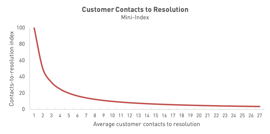
It's exactly what we want because...
- It is now ranged between 0 and 100%, so we can easily mix it with other ranged KPIs
- We get a '100%' score if we resolve every problem on the first customer contact with us
- It gives much more importance to 'early changes', so the change from an average of one contact to an average of two contacts takes us from 100% to 50% (a decrease of 50%) but moving from 19 to 20 contacts takes the index from 5.26% to 5.00% (a decrease of just 0.26%)
If we aren't getting quite what we want, we can easily tweak the shape of the curve and the axis intercept by tinkering with the maths and coefficients of the graph. In doing this, we have built a 'mini-index' ready to be mixed with the others, to create our finished product.
Handling ‘wrong way round’ KPIs
Earlier on, you reviewed each of your ingredient KPIs and identified whether they were open-ended / ranged and bigger=better / smaller=better. So, what do you do if one of your ingredient KPIs going up is a good thing while another going up is a bad thing?
You have two options for dealing with this:
- 100% - measure (for ranged metrics)
-
1 / measure (for open-ended — but be careful with zeroes! If your measure value tends towards or hits zero, you will get a massive/infinite figure)
Once you have that sorted, double-check that each element of the index algorithm pushes the overall score in the 'right' directions when each element varies (use the 'Does that make sense?' test).
Sweet spot KPIs
Some KPIs aren’t about more or less — they’re about just right. Think of a Goldilocks zone.
Ruby has one of these: Contact Handle Rate. Too fast = rushed service. Too slow = inefficient.
Check out the example below to see how we handle these.
Example: Ruby Builds Her Mini-indexes
Ruby looks at each of her four ingredient KPIs...
1. Number of customer contacts to resolution:
This is an open-ended, more is worse KPI. This needs some work. The following relationship turns it into a ranged mini-index which gives a higher score for a a lower average number of customer contacts required for problem resolution:
[Average number of customer contacts, mini-index] = 1/[Average number of customer contacts]
2. Call Listening Score:
This is a ranged, more is better KPI already. So it's ready to go as it is.
3. Customer Feedback Score:
This is a ranged, more is better KPI already. We just need to convert it from a 1-10 score to a percentage.
4. Contact Handle Rate:
This is a sweetspot KPI. Ruby has discovered that the best calls take an average of 10 minutes, but between 8 and 12 minutes should be fine. Outside of these times, the calls are too rushed or too slow. After some messing about with a graph plotting tool, Ruby develops this chart formula:
[Average handle rate, mini-index] = 1 - (0.005 * (x - 10) ^4
The problem with this formula is that the score decays nicely as the calls take less than 8 minutes or more than 12 minutes, but can then go negative. This doesn't really do what we want it to.
We can fix this by using some logic in Excel. Here's the formula that forces the score to zero when the output value becomes negative:
[Average handle rate, mini-index] = IF((1-(0.005*(x-10)^4))<0,"0",(1-(0.005*(x-10)^4)))
Here's what the curve for this looks like when we plug it into Excel...


Figuring out how important each KPI really is
Ranking your ingredient KPIs
Now that you’ve got your KPIs nicely cleaned and prepped, it’s time to figure out how much each one really matters. Not all KPIs are created equal—some deserve a starring role, others are more background vocals.
Here are the best ways people decide on weightings, in order of importance:
- Fundamental physical relationships: These are set in stone. Like density = mass ÷ volume. Not up for debate.
- Empirical relationships: We don’t fully get the 'why', but we do see a pattern. Like, “When the temp goes up by 10°C, we sell 20% more soft drinks.”
- Group opinion: The team agrees that customer service rep hairstyle accounts for 20% of customer satisfaction. (A bold choice.)
- Solo decision: “I’ve decided that website hits are 10% of our engagement index.” No discussion. Deal with it.
Example: Ruby Ranks Her Four Ingredient KPIs
Ruby rounds up her team for a performance metrics face-off. After a few strong opinions (and an almost-heated debate over Contact Handle Rate), she decides none of them are 'do or die' and ranks them like this:
-
Customer Feedback Score (most important)
-
Number of Contacts to Resolution
-
Call Listening Score (tied for 3rd)
-
Contact Handle Rate (also tied for 3rd)
There’s no obvious mathematical relationship between them, and Ruby’s not keen on trying to build an elaborate statistical model. She’s going with informed judgement.

Working out the maths of your performance index
This is where we build the engine under the bonnet. Don’t worry—it’s mostly simple arithmetic.
What kind of maths are we talking?
For most performance indexes, you’ll just need basic stuff:
-
Addition
-
Subtraction
-
Multiplication
-
Division
Occasionally, if your index is based on a physical relationship—like Body Mass Index—you might need to bust out an exponent or two. But usually, you won’t need anything more exotic than what’s in your school maths textbook.
Is the index actually meaningful?
A solid performance index needs a meaningful relationship between its parts. You could make one from “the price of fish” and “favourite trouser colour of politicians,” but that doesn’t mean you should.
When the logic behind your ingredients holds up, the index works. If it doesn’t, it’ll fall apart the moment someone asks, “What am I looking at?”
For a performance index to work there needs to be a relationship between the things you are reporting. Sometimes this will be obvious, like where there is a physical relationship between the behaviours and the top level measure - such as fuel efficiency and Eco Score on Toyota cars. In that situation, the 'Eco Score' is a leading KPI of fuel economy. If you get that algorithm wrong, it will become clear when you get a 'good' Eco Score and poor fuel economy.
In other situations it may not be so clear cut; for instance, where you are trying to measure 'staff engagement' or 'customer service'. There will be lagging KPIs of the effectiveness of both of these metrics but those outcomes are partially determined by outside factors, so it's not completely clear-cut.
Time to build your performance index algorithm
Let’s make it less scary: an “algorithm” here just means a step-by-step formula for combining your ingredient KPIs into one useful score. These formulas are the building blocks behind many business intelligence dashboards — powering the charts and scores that leaders rely on to make fast, informed decisions.

Should you use a multiplier?
Ask yourself: “If this KPI tanks, do the other KPIs still matter?”
Yes? Then it can just be part of the formula.
No? Use it as a multiplier. That way, when it goes to zero, the whole index drops to zero—just like it should.
Example: If your site gets zero visitors, does it really matter how fast it loads or how slick the design is? Not really. So you’d use visitor count as a multiplier ([visitor numbers] x [the rest of your index]).
Mixing your KPIs: the mechanics
Earlier on, you considered the logic of how your ingredient KPIs interact. Now, you need to express this as a formula.
Different elements have different importance. You can weight each element to contribute to the final score like this...

The key ways to tweak and control your algorithm are:
A) Big tools (high impact) in descending order of amplification
-
Exponents (raising something to the power of x): Powerful, but risky. Handle with care.
-
Multiplication/Division: Good for when KPIs have an amplifying effect.
-
Addition/Subtraction: Straightforward and usually safe.
B) Small tools (fine-tuning):
-
Coefficients: Fixed weights that make sure one element doesn’t dominate unfairly.
-
Correction values: These are offsets (like the +c in y = mx + c) that adjust your final number.
Watch out for weird maths
⚠️ Infinity problems

If your formula divides by something that can drop close to zero, your result might skyrocket into the millions. That’s rarely what you want.
Example:
Let's say we are dividing A by B to give answer C.
If A is 5 and B is 10, then C= 0.5
If B heads down to practically zero, let's say 0.000001, our result shoots up to 5,000,000.
As B tends towards zero, C tends towards infinity.
Now it may be that answer is a fair reflection of what you are trying to show. More often though, it's the unexpected side effect of the way the index is designed.
🎂 Two wrongs don’t make a right

Imagine you’re baking a cake:
5g too little sugar
5g too much salt
→ Total variance = 0g?
Nope. That’s still a gross cake.
| Ingredient | Target | Actual | Difference |
|---|---|---|---|
| Flour | 300g | 300g | 0g |
| Sugar | 75g | 70g | -5g |
| Salt | 3g | 8g | +5g |
| Egg | 50g | 50g | 0g |
| Net error | 0g |
In KPI-land, this means: don’t let over-performance in one area cancel out under-performance in another. Use absolute values of the variance if necessary to stop good and bad from cancelling each other out.
Example: Ruby Designs the Maths of the Customer Service Index
Ruby decides that she will use her four mini-indexes ranged from 0-100, then create an overall weighted index where the mini-indexes are mixed in the following ratio...
- Number of Contacts to Resolution = 25%
- Call Listening Score = 20%
- Customer Feedback Score = 35%
- Contact Handle Rate = 20%
Next, she builds a spreadsheet with:
-
Clear, step-by-step maths
-
Rationale for each choice
-
Real data to see how it all behaves

And here's the second part of the model, with some actual numbers...


Test, Tweak, and Deploy
You’ve got a formula. You’ve got scores. Time to give it a proper test drive.
Sanity check: does it behave?
Create a test spreadsheet with different scenarios—including extreme ones. Try zero values, weird combos, and best/worst case scenarios. Then ask:
“Does this result make sense for what’s going on?”
Bring in the humans: test your prototype with your audience
If others will use or be measured by the index, involve them in this final check (though it's best to involve them from Step 1, if you can).
Run a few scenarios and ask questions like:
-
“Does this feel fair?”
-
“Where might this give weird or misleading results?”
-
“What would you change?”
Depending on the responses, you may have to go back to Step 4 at this point or you may have done your groundwork correctly and be ready to launch your new shiny index KPI. This feedback loop helps you refine the measure—and builds trust before it goes live.
Example: Testing Ruby's Customer Service Index
Ruby adds several test cases to her spreadsheet:
-
Worst case: All scores low, resolution takes 8 contacts. Ouch.
-
Best case: All scores maxed out, issues solved on first contact.
-
Weird mix: Great feedback, fast resolutions… but super long calls and low listening scores. Still worth testing!
By walking through these edge cases, Ruby’s able to fine-tune her index and get buy-in from the team.


Case Study: Real-world Example
How an Index KPI (Sort of) Saved My Newsletter
After putting off the task for far too long, I finally decided to tackle my email newsletter. If you've ever tried to run one, you'll know the biggest challenge is deliverability—actually getting your emails into people’s inboxes and not trapped in spam filters.
There are loads of ways your email can get flagged as junk, and it’s easy to feel overwhelmed. But then I found a nifty tool called Mail-Tester from MailPoet. What they’ve done is take this tangled mess of technical detail and turn it into something much easier to handle:
-
A single score
-
A visual rating
-
A plain-English explanation
When you send a test email, you get feedback like this...
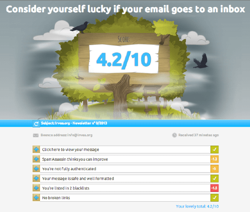
The genius of this is how clear it is. You get a numeric score that shows how well your email is likely to perform, with a breakdown showing:
-
Which parts are dragging your score down
-
How many points you’re losing in each area
-
What to do about it (sometimes with helpful links)
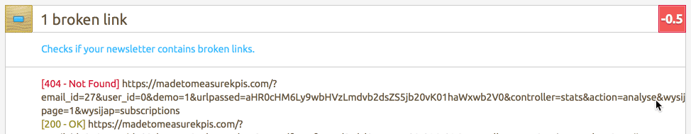
Here's the type of feedback you get in the score breakdown below...
So, does it actually work?
Well… My first test came back with a miserable score of 1.5 and a sad little message saying something like: “Your email will never see the light of anyone’s inbox.” Not ideal.
But after a few tweaks, I ended up with this:
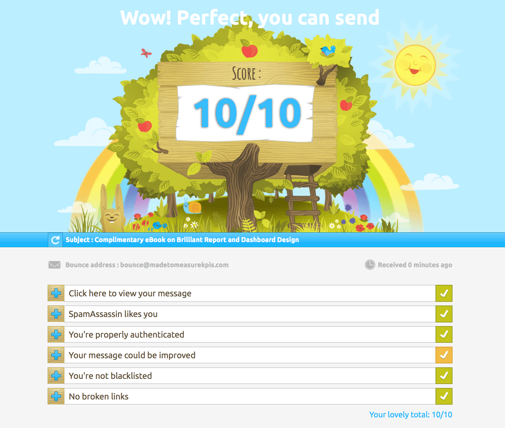
Even with a perfect score, though, iCloud still shoves my email in the junk folder so perhaps I shouldn't have been quite so trusting of their Mail-Tester's scoring index...
Lesson learned—an index score is super helpful, but it’s not magic. That said, it’s a fantastic example of a well-designed index KPI: clear, actionable, and motivating.
Best Practices for Index KPIs
So, you've made it to the end of the EPIK-DS process—nice work! You now know exactly what a key performance index is,why it's useful and how to build one from scratch. But how do you make sure it sticks? Let’s take a look.
What makes a good index KPI?
A solid Index KPI should be:
-
Transparent – easy to understand, even for non-experts
-
Balanced – accurately reflects what’s driving performance
It should help people quickly assess their progress toward a desired performance outcome, without needing to wade through every individual measure.
It should also:
-
Combine elements that genuinely influence the same outcome
-
Offer 'at a glance' insight into a complex situation
-
Help users dig deeper into the real issues
-
Use weightings that reflect the true drivers behind performance
When not to use an Index KPI
Index KPIs are great, but they’re also blunt tools. If you're comparing tiny differences or making major decisions, they shouldn’t be your only source of truth. Some other watch-outs:
-
Poor design or weighting can make the results misleading
-
Conflicting trends can cancel each other out
-
A good-looking number might hide important red flags
Some situations where using an index KPI might be risky:
- The audience is a casual (or not very sophisticated) audience, so they don't have the time, inclination or ability to understand how the index KPI works
-
There is little meaningful causal relationship between the different elements of the index KPI
- The index has not been explained to the target audience or they don't trust the measure
-
It’s not clear what to do with the result
If you have any doubts about how the index works, you need to pull it apart, understand how it works and do some deeper analysis of the constituent measures.

When Index KPIs Go Wrong: The Bradford Factor
One of the worst examples of a badly designed Index KPI is the Bradford Factor, which attempts to make workplace disruption caused by sickness quantifiable. (Read more about it here - note that no-one has ever found the supposed research that this measure is based on and Bradford Business School have pointedly distanced themselves from any involvement in its creation.)
The formula is: B = S² × D
Where:
-
S is the number of absences
-
D is the total number of days off
Here’s what that looks like:
| Employee | Sick Days | Absences | Score |
|---|---|---|---|
| Tim (back surgery) | 20 | 1 | 20 |
| Sarah (chronic asthma) | 20 | 20 (half-day absences) | 8,000 |
Same number of days off, completely different scores. This index punishes people with chronic conditions, despite the same total time off. Worse still, it's still used in real organisations.
Making Sure Your Index KPI Gets Used
You’ve done the hard work, built the index, and tested it. Now what? You need to make sure it actually gets used. The secret? Buy-in.
Get people involved early
The best way to avoid pushback (or worse, indifference) is to get the right people in the room from the start. Here’s how to keep them on board:
-
Invite the right voices – especially the people who’ll use or be judged by the index
-
Explain the problem you're trying to solve
-
Discuss all the options for tackling this problem together, not in a vacuum
-
Agree on the ingredient KPIs to use
-
Genuinely listen to concerns—they might save you from a bad design

Help users understand the measure
A simple one-pager or ‘KPI Cheatsheet’ can go a long way. Keep it handy for new team members or as a quick refresher.
Most critically, performance indexes will be used if they are seen as useful.
For more tips on building buy-in, check out our blog post: How to Get Staff Buy-in For KPIs.
A Final Thought
Index KPIs can be powerful tools—but only if they’re well thought out and clearly communicated.
They take time and effort to build, but that investment can pay off fast by making complexity easier to manage and helping you drive the right behaviours.
Bookmark this page for future reference – whether you’re still figuring out what a key performance index is or want to get certified in building them, our Index KPI Design Course can help.
Still got questions? Check out our Index KPI FAQ page. Good luck out there!
More questions? Check our our Key Performance Index FAQ page.


")
")