5 Common Dashboard Design Mistakes (and How to Fix Them)
How many of us have been here: you’ve spent hours building a dashboard. You’ve pulled in all the latest numbers, added data visualisation, polished it up, and shared it with your team.
And then… chaos.
Stakeholders are firing questions left, right, and centre:
“Wait, what does this chart mean?”
“Why is this important?”
“Are we winning or losing here?”
"Can't we just have ONE number that tells us how we're doing?"
By the end of the meeting, decisions are being made based on 'gut feel' rather than the metrics you worked so hard to gather.
Or maybe you've been on the flip side... silence.
You make your presentation but eyes glaze over. Questions fumble. People nod politely but don’t engage. By the end of the session, your report is ignored, your insights lost, and your credibility dented.
Either way, people leave frustrated and you’re left wondering why no one is using the dashboard you slaved over.
The culprit? Most dashboards fail because of common data visualisation mistakes that turn clarity into confusion.
Your Goal
Your goal is simple: communicate insights clearly. When dashboards don’t help people understand the story, your stakeholders get confused, frustrated, and disengaged.
Let’s look at the top five dashboard design mistakes to avoid (and how to fix them).
Mistake 1: Using Pie Charts (Or Their Trendy Cousin, Doughnuts)
Pie charts get used a lot more than they should. The main reasons for this seem to be...
- They're easy to understand at a glance (good reason)
- You can make two data points look impressive and take up a lot of space (bad reason)
- They look a bit different from the rest of the charts on the page (bad reason)
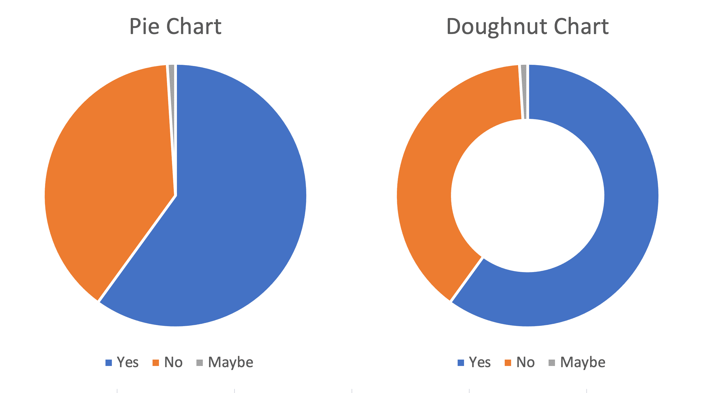
Here's why you really shouldn't use pie or doughnut charts:
- You cannot trend data on pie/doughnut charts
- You cannot see performance versus a target bar on a pie/doughnut chart
- Smaller values are hard to see and to label properly
- Readers actually struggle to compare proportions easily on pie graph
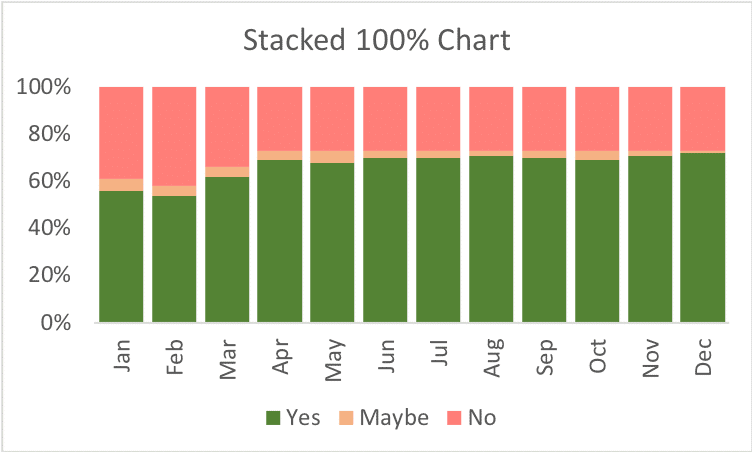
Fix it: Try a 100% stacked bar chart instead. It shows proportions clearly, highlights differences, and keeps things readable. Stakeholders can see the story instantly without needing explanations.
Here's an example of one. See how much faster and easier it is to absorb the information compared to the pie charts?
Mistake 2: Using Visual Gimmicks
It's tempting to add visually appealing items like pressure gauges, thermometers and volume meters like this...
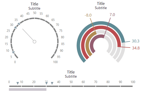
However, these are often used in an attempt to 'cover up' relatively few data points or to try to impress an important audience.
Advice from a KPI reporting expert? Don't use them. They don't enhance understanding; rather they create visual clutter that actually makes the report harder to grasp.
When dashboards have these distractions, stakeholders often:
- Ask endless questions about what each visual is supposed to show.
- Focus on the shiny bits rather than the insights.
Fix it
Fix it: Show the data as simple charts or numbers, and add trend information to the 'sparse' data points. Adding trend lines creates context for the current data points, making insights more actionable and meaningful.
And as a KPI expert, I'm here to tell you: don't be ashamed of having only a few data points. No-one complains when a meeting is shorter than its allocated schedule and I've never heard anyone complain that a dashboard is too simple.
Mistake 3: Trying to Fit Too Much on One Chart
A classic tactic used to 'save space' in reports is to cram lots of data onto a handful of charts.
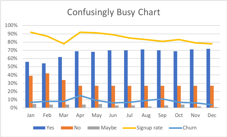
This can dramatically reduce the ease of understanding for the reader. They're given busy, confusing visuals that leave them squinting and guessing.
A better tactic for saving space is to use one or more key performance indexes: consolidated single scores showing complex situations simply.
Fix it: Only combine data if the comparison is meaningful and insightful. Otherwise, split into multiple graphs or use Excel Slicers to let users filter and explore. Another option is to create key performance indexes that summarise complex information into one clear score.
Bonus: The BI Trap — Fancy Tools, Same Problems
Let’s be honest: switching to Power BI doesn’t magically fix report confusion. These tools are powerful, but they can’t save flawed design or warn you when you're making common dashboard design mistakes.
If you’re unclear on what story you’re trying to tell, you’ll just make better-looking confusion.
Good reports - whether built in Excel or Power BI - follow the same rules: keep things simple, clear, and focused on decisions. Tools help, but principles win.
Mistake 4: Using Misleading Axes
Starting a vertical axis somewhere other than zero can make tiny changes look dramatic.

This can give the impression that a value is swinging wildly, when we may actually be looking at small levels of natural process variation. Journalists, in particular, seem to do this when they want to create a dramatic story out of something that isn't significant.
Fix it
Fix it: Always use honest scales. Clear visuals build trust and let decisions happen based on facts rather than fear.
Mistake 5: Using Colour Without Thinking
Colour is one of the most powerful encoding tools you have in dashboard and report design.
Used consistently and sparingly, it can be incredibly effective at signalling extra information to the reader.
Used carelessly it can make a dashboard feel like a room full of people all shouting over each other to be heard - it loses any effectiveness. Here's a really extreme example:

When too much colour is used without any structure, it turns a report into a visual headache. Stakeholders may then:
- Miss the important data because everything is shouting for attention.
- Ask repeatedly, “What does this red mean here? And green there?”
- Make decisions based on whatever pops out, not what matters most.
Fix it
Fix it: Use colour sparingly and consistently. Reserve it for trends, alerts, or key highlights. Let your data speak clearly without shouting.
Bonus: The Hidden Problem Behind Most Dashboards
Before we even get to colours, charts and layouts, there’s a deeper issue at play. One of the biggest mistakes people make is jumping straight into designing reports without first deciding what story they’re trying to tell.
If you don’t choose the right KPIs—or worse, if you throw in every number you can find—you’ll end up with a lack of focus. The result? A beautiful report that doesn’t actually help anyone make a decision.
The Metrics You Choose
The metrics you include should come from a clear, structured system for deciding what really matters. Without that, it’s far too easy to create a “data dump” instead of a decision-making tool.
Our ROKS method is a proven, systematic framework for finding the most important KPIs that will actually impact business performance.
Data Sources
Let's not forget data sources. Many teams pull numbers from different places—each using slightly different definitions or update cycles. If you don’t align those early, your report can end up being technically correct but practically useless.
Creating dashboards that help users understand the data (and the story) isn’t just about visuals—it’s actually about communication and intention. When you start with clear KPIs, reliable data, and a single focus, you create data-driven reports that people actually trust and use.
Why Stakeholders Get Frustrated
The five mistakes we've covered today plus our bonus hidden problem all contribute to stakeholder frustration.
Stakeholders are bombarded with numbers they don’t understand, buried in information overload and split focus, and end up spending meetings asking questions instead of making decisions.
This frustration often shows as:
- Spending meetings asking endless questions about charts and numbers instead of making decisions.
- Decisions being delayed or made without clear evidence.
- Stakeholders tuning out and ignoring dashboards entirely.
- A sense that meetings are unproductive and a “why bother?” attitude sets in.
Your goal is to prevent all that by communicating insights clearly. Avoiding these five dashboard design mistakes is the first step but there are many more report design principles you need to know in order to successfully communicate vital insights that save the day.
How to Fix It and Win Back Your Stakeholders
Here's where the Brilliant Excel Dashboards online course comes in:
- Learn step-by-step dashboard design principles that cut clutter and confusion.
- Get ready-to-use Excel templates that follow all the best practices.
- Understand how to use colour, layout, and charts so stakeholders see the story immediately.
- Turn raw data into dashboards that people actually read, understand, and act on.
- Download our 54-point dashboard checklist.
Whether you’re redesigning an old report or designing dashboards from scratch, this course is your shortcut to clarity, engagement, and dashboards that finally deliver.
With our online course, building brilliant dashboards is simpler than you might think and the payoff is huge.
The Bottom Line
Dashboards should do one thing: communicate insights clearly. Every pie chart, flashy gauge, crowded chart, misleading scale, or sloppy colour choice is a roadblock between you and that goal.
Avoid the top five dashboard design mistakes, learn from bad dashboard examples like the ones we've shown you above, and give your stakeholders reports they can trust.
And if you want a proven framework that follows the best dashboard design principles with templates and expert guidance, the Brilliant Excel Dashboards course is the ultimate next step.


