


Ultimate XmR SmartChart Guide
Are Your KPIs Lying to You? Discover the Truth with SmartCharts
As managers, we rely on Key Performance Indicators (KPIs) to tell us how our business is performing. We chart them over time, watch for trends, and compare them against targets or previous periods. Yet, despite these efforts, making informed decisions based on our KPIs can feel incredibly difficult.
What if I told you that the way you're currently presenting and interpreting your KPIs might actually be misleading you? That the widely accepted methods you use could be hiding the truth and causing you to waste time, effort, and money?
It's a surprising thought, isn't it? Especially since these methods are popular and common in many organizations. We've just always reported KPI data this way. But popularity doesn't always equate to best practice. The reality is, many traditional KPI reporting methods can lead us to act when we shouldn't, or worse, not act when we should. This is where SmartCharts come in – a powerful, statistically grounded method to cut through the noise and reveal the true story your KPIs are telling.
The Deception of Traditional KPI Reporting
Let's look at the methods that often mislead us:
- Moving Averages and Trend Lines: These are often used to smooth out fluctuations and show the overall direction a KPI is heading. While they can appear helpful, they can obscure important changes or suggest trends that aren't statistically significant. Using a moving average, for example, involves averaging values over a period (like 12 months), with the intention of smoothing variation, especially seasonal variation. However, this smoothing can actually mask underlying signals of change. Similarly, trend lines calculated by software summarise direction but don't tell you if that direction is meaningful.
- Month-to-Month or Year-on-Year Comparisons: This involves simply looking at the difference between the current period's value and the previous period's or the same period last year. While easy to do, large percentage changes month-to-month don't necessarily indicate a real signal, and small differences aren't necessarily just noise. Comparing December to November misses the bigger picture of change over time.
- Comparing to Targets, Benchmarks, or Standards: Many organizations continually compare KPI values to predetermined targets. While targets can be part of the motivation for improvement, judging performance solely by whether a value meets a target can be misleading. Control limits on a chart are set by the process itself, whereas gage limits are set by specifications. Comparing the process output to arbitrary targets that aren't based on the process's historical performance level can be a waste of time if the process is already performing as well as it can in its current design.
All of these methods can cause our KPIs to tell us lies. They don't help us know how much of the difference we see in our measure values is just random variation (noise) or a real signal of change. Relying on these methods can lead us to behave in ways that make performance worse rather than better.
Introducing SmartCharts: Separating Signal from Noise
The solution lies in using statistically-based control charts, specifically XmR charts, which we like to call SmartCharts because they are definitely smarter than most other methods for understanding how KPIs change over time. These charts, rooted in the work of Walter A. Shewhart nearly 100 years ago, are designed to distinguish routine variation (noise) from exceptional variation (signals) in time series data. They provide a valid, statistically confident way to determine if a process is improving, getting worse, or staying flat.

Walter A Shewhart
XmR charts are a fundamental tool in statistical process control (SPC), traditionally used heavily in manufacturing and quality control. However, their principles are applicable to any measure that changes over time.
How SmartCharts Work: The Basic Concepts
A SmartChart (XmR chart) is built upon a foundation of historical data plotted as a time series. It adds two crucial elements to this basic line chart:
- A Horizontal Central Line: This blue line represents the measure's current performance level, essentially the average of the data within a stable period.
- Variation Range: This area, between the Upper and Lower Natural Process Limits indicates the natural variation range of the measure. It shows how much variation is inherent in the process due to common, routine causes.
An XmR chart actually consists of two related graphs: the X-chart (or Individual chart) and the Moving Range chart.
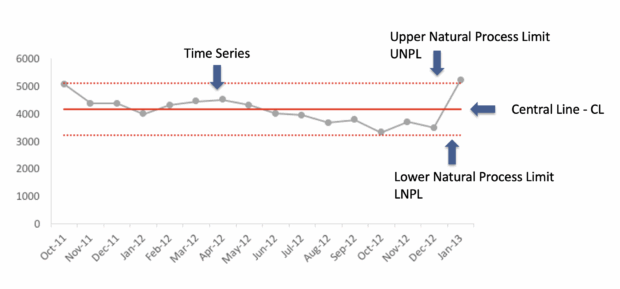
The X-chart plots the individual KPI values over time.

The Moving Range chart plots the difference between consecutive points. Limits are calculated for both charts based only on the variation present in the data itself, allowing you to see if individual values or the point-to-point variation are exceptional.
The power of SmartCharts comes from calculating the central line and the limits (often referred to as control limits) using specific, statistically derived formulas. These calculations aren't arbitrary; they are designed to help you objectively identify when a change is more than just random fluctuation. For example, in an XmR chart, the Upper Control Limit for the individual values (X-chart) is calculated as the Average X plus 2.66 times the Average Moving Range. The Lower Control Limit is the Average X minus 2.66 times the Average Moving Range (using 0 if the result is negative and negative values are impossible for the metric). The Upper Control Limit for the Moving Range chart is typically 3.268 times the Average Moving Range.
Interpreting SmartCharts: Finding the Real Signals
The key to interpreting a SmartChart is understanding the concept of signals. SmartCharts have specific rules to help you identify when a real change in performance has occurred.
- Noise: If all the points and patterns on the chart fall within the variation range and don't violate any of the specific signal rules, the process is considered stable or predictable. Any up-and-down movement within the zone is simply routine variation or noise. In this case, there is no evidence of a real change in the process's performance level. Reacting to these individual points or looking for specific causes for each minor fluctuation is a waste of time. The process is performing as well as it can under its current design. Improving it requires a fundamental change to the system.
- Signals: When points or patterns violate the signal rules, the chart is telling you there's been a real change in the process's performance. This is an exceptional variation that is unlikely to be due to chance alone. A common signal is a point falling outside the calculated control limits. Other rules involve patterns like a run of consecutive points on one side of the central line. When a signal occurs, you are justified in looking for an assignable cause for the change. This is when investigation and action are necessary and impactful.
It's vital to remember that while the chart identifies that a change has happened, it doesn't tell you why. The story behind the data is essential for understanding the cause and deciding on the appropriate response.
Why SmartCharts Solve Management Issues
SmartCharts directly address the shortcomings of traditional KPI reporting and provide valuable insights for managers:
- Objective Decision Making: They provide a statistically sound basis for deciding when to act and when not to act. This prevents the wasted effort and cost associated with reacting to noise.
- Clear Understanding of Performance Level and Variation: The central line shows the current average performance, and the variation range shows how much fluctuation is normal. This provides a clear picture of the process's capability.
- Accurate Measurement of Impact: When a signal indicates a real change to a new performance level, SmartCharts make it easy to recalculate the central line and limits for the new period. You can then objectively measure the size of the change and quantify the impact of improvement initiatives or external factors.
- Focus on Process Improvement: By showing the true process capability, SmartCharts highlight that improvement requires changing the system itself when the process is stable, rather than simply chasing arbitrary targets.
- Revealing Hidden Signals: SmartCharts can detect real signals of change that might be missed when relying on comparisons or smoothed data.
These charts are designed to answer the exact questions managers need to ask about their KPIs: What is the current performance level? Is there any real change? How much change occurred? Do I need to take action? What causes should I investigate?
Important Considerations
While powerful, SmartCharts are not a universal solution and must be used correctly:
- Data Requirements: They are best suited for continuous data collected as a time series. They are generally not appropriate for rare events where the average is below 1.0; other charts like c-charts are used in those cases. You also need a sufficient number of data points to establish the initial central line and limits, ideally 12 to 20 historical points.
- Following the Rules: The statistically derived rules for calculating the central line, limits, and interpreting signals are critical. Deviating from these rules creates a "dumb chart" that is just as misleading as traditional methods.
- Targets: While management often wants to compare to targets, targets are not typically plotted as simple straight lines on SmartCharts. There are different, more powerful visual methods for incorporating targets that are covered in more advanced training.
What is an XmR/Smart Chart?
An XmR chart is a type of control chart used for time-ordered data, particularly continuous data. It helps distinguish between expected, routine variation and unusual, assignable cause variation in a process. The chart consists of two parts:
- The X-chart (or individuals chart), which plots individual data points
- The MR chart (or moving range chart), which plots the variation between consecutive points
Smart charts are built on the foundation of a basic time series graph. They add a horizontal central line representing the measure's current performance level and a shaded zone indicating the measure's natural variation range.
How to Create an XmR/Smart Chart
Creating an XmR chart involves collecting data, calculating the central line and limits, and plotting the data and limits on two connected charts. There are specific, statistically derived rules for these calculations that cannot be made up.
1. Choose a KPI and Collect Data
- Select a KPI that consists of consecutive measure values forming a time series. The X-axis should represent time or date in order.
- The data must be continuous (e.g., temperature, money, height). XmR charts are not appropriate for count data or rare events (C-charts are used for these) or data with rational subgroups where non-similar data is mixed.
- Ideally, choose a KPI with 12 to 20 consecutive measure values for initial understanding. More historical data is beneficial. The minimum is 5 points.
- Collate the measure values in a spreadsheet.
2. Plot a Basic Time Series Chart
- Chart the KPI data into a simple line chart in a spreadsheet, plotting the values over time.
- Do not add trend lines or moving averages at this step.
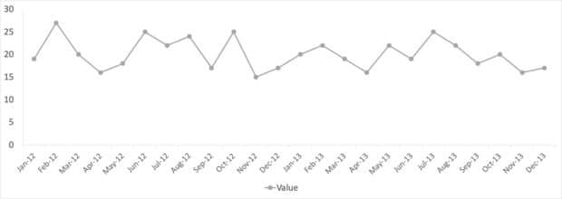
Example time-series chart
3. Calculate Moving Ranges
- Compute the absolute difference between consecutive measure values.
- This directly measures the month-to-month (or period-to-period) variation.
4. Calculate the Average Moving Range (AmR)
- Calculate the average of all the moving ranges computed in the previous step.

Average Moving Range
5. Calculate and Plot the Moving Range (MR) Chart Limit
- Calculate the Upper Range Limit (URL) for the moving range chart by multiplying the Average Moving Range by a constant:
URL = 3.27 × Average Moving Range
The value 3.27 is required to convert the average range into an appropriate upper bound.
- Plot the calculated moving ranges on a time series graph, and add the URL as a horizontal line.
- The MR chart typically only has an upper limit.

Moving range mR calculation
6. Calculate the X Chart Central Line
- Calculate the average (mean) of the data points chosen for the baseline.
- This average forms the central line for the X-chart and represents the measure's current performance level.

Calculating the Central Line
7. Calculate the X Chart Limits
- Calculate the Upper Natural Limit (UNPL) and Lower Natural ProcessLimit (LNPL) using the calculated central line (Average X) and the Average Moving Range. The formula involves a constant (2.66) required to convert the average range into control limits for individual values:
UNPL/LNPL = Average X ± 2.66 × Average Moving Range

Upper Natural Process Limit Calculation

Lower Natural Process Limit Calculation
- If the calculated LNPL is a negative number and your process cannot produce negative results, use 0 as the LCL instead.
- These limits define the blue shaded zone on the Smart Chart, representing the measure's natural variation range.
8. Plot the X Chart
- Plot the original measure values on a time series graph.
- Add the calculated central line (Average X), UCL, and LCL as horizontal lines.
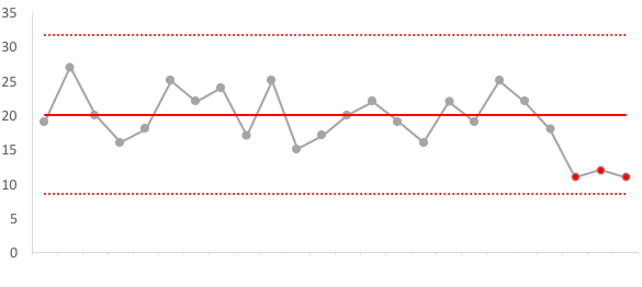
Example X Chart
9. Final Chart Assembly
- The complete XmR chart consists of these two connected graphs: the X-chart and the Moving Range chart.
How to Interpret an XmR/Smart Chart
Interpreting an XmR chart involves applying specific rules to the plotted points relative to the central line and control limits to determine if the process is stable or if a real change has occurred. The goal is to separate routine variation (noise) from real signals of change (assignable causes).
Interpretation Steps
- Check the Moving Range Chart First: Examine the MR chart to see if any moving ranges exceed the Upper Range Limit. A point above the URL indicates excessive month-to-month variation that is unlikely due to chance.
- Check the X Chart: Examine the X chart for signals of change.
- Apply Interpretation Rules: Use the specific rules below to identify signals.
Interpretation Rules
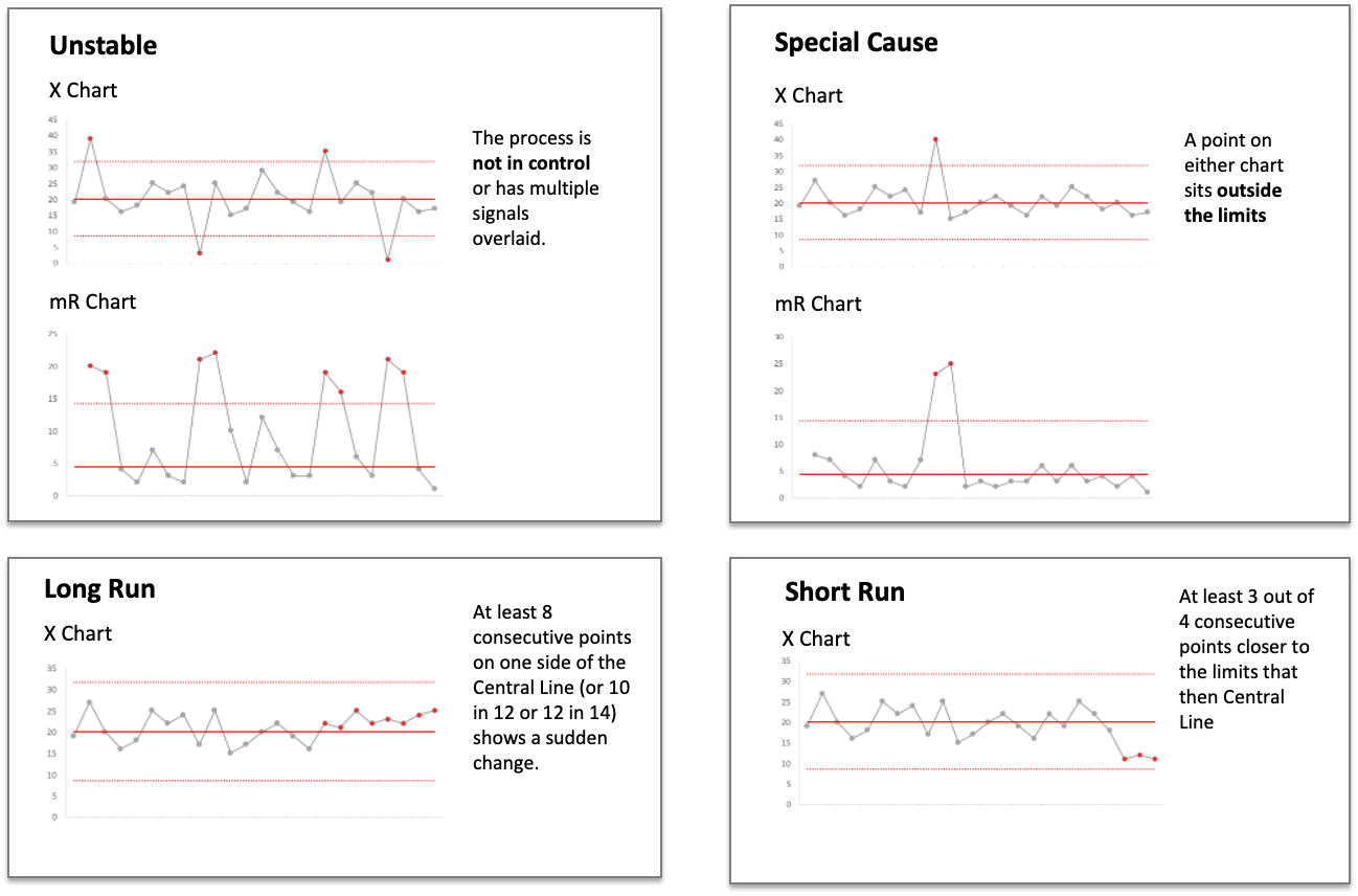
- Unstable: Points lie outside both the Upper and Lower Natural Process Limits.
- Special Cause or Outlier: At least one point falls outside the Upper or Lower Control Limit on the X chart or above the Upper Range Limit on the MR chart. This indicates a definite departure from the average or exceptional variation.
- Long Run (Run of Eight): At least eight consecutive points all fall on the same side of the central line, or 10-in-12 or 12-in-14
- Short Run Near Limits: At least three out of four consecutive points are closer to the limits than the central line. This rule primarily applies to the X chart as the MR chart usually only has an upper limit.
Interpreting the Findings
No Signals
If none of the interpretation rules are met on either chart, the variation observed is considered routine variation or noise. The process is likely stable and performing as well as it can under its current design. Looking for explanations for these points is a waste of time, as they do not represent a real change in performance.
Signals Present
If any of the rules are met, it indicates a signal of real change. This means the process has changed to a new level. You are justified in investigating for an assignable cause – something specific that caused the change. Ignoring signals means missing opportunities for improvement or failing to address problems.
Action After a Signal
- When a signal indicates a real change, the KPI is now performing at a different level.
- To reflect this new performance level, you should recalculate the central line and limits using data points that represent the new status of the process. Knowing when and how many new values are needed for recalculation is clearly defined.
- By recalculating the chart based on the new baseline, you can then continue monitoring for future signals from this new level.
- XmR charts also allow you to objectively measure the size of the change by comparing the difference between the old and the newly calculated central lines. This helps quantify the impact of improvement actions or other factors.
Understanding and applying these steps helps to correctly interpret KPI data, revealing the true story of performance and enabling better decision-making by focusing action where it is needed.
Recap
Traditional KPI reporting methods like moving averages, trend lines, and comparing to targets often hide the true behaviour of your performance measures, leading to wasted effort and poor decisions. SmartCharts (XmR charts) are statistically valid tools that separate routine variation (noise) from real signals of change. By using a central line and variation limits based on the data itself, they provide an objective way to understand current performance, identify significant changes, and measure the impact of initiatives. While powerful, they require understanding and following specific rules to be effective.
Take the Next Step with Expert Guidance

Understanding how to create and correctly interpret SmartCharts is a skill that can transform how you manage with data. If you're serious about getting the truth from your KPIs and making data-driven decisions that truly improve performance, dedicated training is invaluable.
The KPI Black Belt programme includes a full module specifically dedicated to SmartCharts. This training goes beyond the basics, providing:
- Step-by-step instructions for creating SmartCharts
- An Excel template for easy implementation
- Detailed guidance on interpreting signals and responding appropriately
You'll work through practical case studies to apply the technique to real-world data. With expert tutoring and guidance, you'll gain the confidence to use SmartCharts effectively and unlock the full potential of your KPIs.
Don't let your KPIs continue to lie to you. Learn to see the truth and gain the power to drive real improvement.
Follow Us
KPI Certification

Free KPI Newsletter
Online KPI Training
KPI Books


")


