Dashboard Design Checklist for Better BI (54 check points!)
Make your reports easier to read, nicer to look at, and more useful.
Let’s be honest—most KPI reports are either a hot mess or just plain dull. If you’ve ever looked at your own report and thought, “Why isn’t this working?”... this is for you.

What Is the Dashboard Design Checklist?
It’s a comprehensive list of the most common (and annoying) presentation issues that derail key performance indicator reports and dashboards. You can use it:
- Use it as a final check before sending a report out
- To score a report and track improvements
- To reduce the emotion in critiquing someone else's report (“It’s not me, it’s the checklist!”)
- To run mini design audits in your team
Your KPI Report Presentation Guide
This dashboard design checklist is here to help you spot all the little things that can make a big difference to reporting of your KPIs and your overall analytics game. After all, if your dashboards don’t support your strategic goals, what’s the point?
Maybe you’re fixing an old report. Maybe you’ve just built a shiny new one and want to make sure it’s not secretly terrible. Either way, this guide helps you figure out what’s working, what’s not, and how to fix it. It’s based on dashboard best practices, but without the boring theory.
It’s long (54 questions!), but it’s worth it. You don’t need to tick every box every time—but it’s a great way to train your eye and get feedback that’s not just “I don’t like the colours.”
You can even give your report a score if you’re feeling brave. It’s not perfectly scientific, but it’ll help you measure improvements and take some of the sting out of feedback on existing dashboards and reports.
How to Use It
You’ll find the checklist broken down into practical sections.
You can either score each question from 1 (poor) to 5 (excellent) or just use it as a sense check.
Don’t worry if you don’t hit 5s across the board—this is about improvement, not perfection.
54-Question Dashboard Design Checklist
🖌️ Visual Design
Is your report easy on the eyes, or does it look like a PowerPoint from 1998?
- Is colour used to convey additional information?
- Are colours used consistently for the same meaning?
- Is a consistent design theme used for all charts and text boxes?
- Are there unnecessary boxes and dividers?
- Do dividers and boxes lead the eye in a helpful way?
- With RAG (red-amber-green) - aka 'traffic light' - indicators, is it clear what criteria are used for RAG?
- Are there unnecessary tick marks?
- Are there unnecessary borders on chart areas?
- Is the background unnecessarily shaded?
- Are the columns/bars unnecessarily shaded?
- Are there unnecessary borders on columns?
📐 Layout
It’s not just what you show—it’s where you show it.
- Is text and chart size used proportionate to the importance of the information it's conveying?
- Are data points that need comparison near to each other?
- Are logos and ornamentation kept to a bare minimum?
- Is spacing consistent and pleasing?
- Are lines used to guide the eye in a meaningful direction?
- Is there a "logical hierarchy" for text and comments?
🧭 Structure
Can people actually find what they need?
- Are there large amounts of numbers that need to be read to understand the high level situation?
- Can you quickly navigate to the section of the report you need?
- Is it clear where the biggest issues are and how to navigate to find more information?
📊 Charts
Charts should do more than look pretty. Good visualisation means instant insight.
- Do the graphs and charts meet your objectives?
- Are the charts intuitive, i.e., they do not require careful study or explanation?
- Do the charts have impact and give insight?
- Do the charts allow meaningful comparison of relevant data sets?
- Do charts clearly show patterns and trends?
- Does understanding the document tax your short-term memory too much?
- Do your eyes have to leap about the page to understand the document?
- Do the charts answer an obvious question(s)?
- If the chart uses 3D, is 3D actually required to represent the information?
- Is the message clear?
🎯 Targets and Axes
Helpful KPI targets. Honest axes.
- Are targets clearly different from metric data sets?
- Are the axes "fair" and clearly labelled?
- Are the fonts clear, the right size and readable?
- If we use a double axis, is it required to make a valid point?
📈 Trending
Trends should tell you something—not confuse you more.
- Is there meaningful trending?
- Are gridlines aiding or obscuring clarity?
- Is there unhelpful use of colour and area/fill patterns?
🏷️ Labels and Labelling
Say what you mean, and keep it clear.
- Are all charts clearly labelled (avoiding jargon or acronyms)?
- Is it clear what period the charts refer to?
- Are labels physically near to the things they are describing?
- Is jargon defined?
- Is the level of labelling appropriate or is it obscuring the chart (or the message)?
- Are numbers on the chart given to realistic precision (i.e., not to 5 decimal places if that precision is inappropriate for the accuracy of the source data)?
✍️ Text and Commentary
Less waffle. More meaning.
- Is the text clear?
- Is the text relevant?
- Is the text concise?
- Is the text spelled correctly and without grammatical errors?
- Can you tell which chart the text is talking about?
- Is the text readable?
👀 Visual Clarity
Looks matter. Especially when you’re tired and scanning at speed.
- Is it the best size?
- Does the layout work for the delivery medium (e.g., a smartphone or projector)?
📬 Other Things to Consider
A few final touches that make a real difference. These elements will support efficient analytical decision-making.
- It is possible to understand the general message "at a glance"?
- Is it clear who created the report and contents?
- Is it clear who to talk to if there's a query or correction and how to contact them?
Want to Practise?
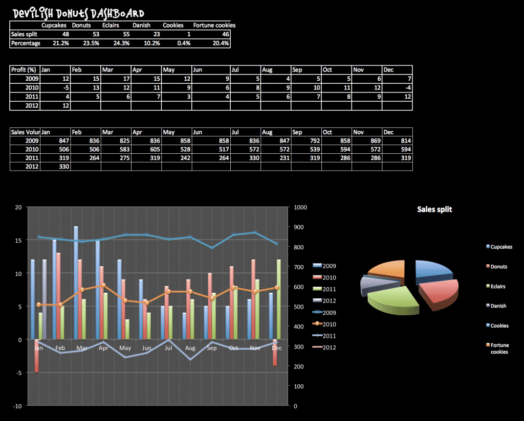
Here’s a KPI dashboard that breaks just about every rule in the book. I mocked it up as a “bad dashboard example” in my Dashboards Manual book—try using the checklist above to spot the crimes!

Want to Build Dashboards That Actually Get Used?
The checklist is a brilliant start—but if you really want to step up your dashboard game, the Brilliant Excel Dashboards course is your next move.
🎓 Brilliant Excel Dashboards is an online course that takes the rules in this checklist and shows you exactly how to apply them in real life. You’ll get:
- Ready-to-go Excel dashboard templates that follow all the design rules (so you don’t have to start from scratch)
- Clear walkthroughs that show you how to use colour, spacing and layout for maximum clarity
- Tips on writing commentary that actually helps people make decisions
- The full Brilliant Excel Dashboards Manual PDF download
Whether you're fixing an old report or building a new one, this course helps you go from “meh” to “wow” without hours of faffing about.
💡 Prefer to start with a read? My £1 Brilliant Excel Dashboards manual includes visual examples and a handy download pack with a printable version of this checklist.


