


Bernie Smith
Are your KPI reports a mess? A half day report-design course.
Do you wish you could glance at a simple report or dashboard and instantly grasp the key opportunities for your business? Dashboards have become increasingly popular in recent years, but many don’t deliver their full potential. If they don’t deliver instantly what the user needs, then the chances are they will never be used again.…
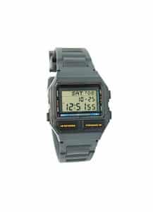
Graphs, your choice of watch and how not to get eaten.
I can still remember how excited I was when, aged 7, I got my first digital watch. It was clear to me that digital watches, with their accuracy and lack of complicated hands, were going to conquer the world. So why am I here 33 years later with an analogue watch? Surprisingly it’s to do…

How to get a perfect quality score in 24 hours…
Many KPIs and targets can be an invitation for creative dishonesty. How do you make sure you don’t accidentally drive self defeating behaviours?

Too many reports? A great tip…
A friend of mine recently mentioned her brilliant tip for finding out how many people read the reports that you send out. She decided to password protect the regular report that she sent out to over 300 people. Just two people requested the password. If you have a sneaking suspicion that people aren’t reading the…
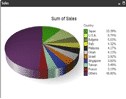
Pointless Pies
I’d like to ban pie charts. I know it’s a bit over the top, but I honestly can’t see a single thing they do better than other graph type (like a 100% stacked bar). They are also hopeless at lots of other things, namely: You can’t trend with them. Yes, you can put a few…

1000 irritations or 1 catastrophe?
How most banks complaints systems drive them to fix trivial problems first and ignore the rarer customer disasters.

Why some KPIs are like pasta makers
We keep things for lots of reasons. Understanding why we hang on to kitchen gadgets we never use can help us work out tactics for getting rid of unused KPIs.


Three questions to tell if your strategy is broken
Imagine going into a map shop and saying “You know a lot about maps, I’d like you to recommend some good ones?”. It sounds pretty silly, and it’s pretty clear that the response will be “Well, where do you want to go?”. Strangely enough, many people and organisations don’t get beyond the first question when…

Too many measures, not enough space?
A really common problem I see is that at some point, no matter how small you make the graphs and tables, you run out of space to show everything you want to show in a report or dashboard. What do you do? You can leave stuff out, but that can often unbalance the view you…