


Bernie Smith

Setting up your meetings well – 10 point checklist
I’ve sat through a lot of meetings. Many of them were terrible and ineffective. There are a lot of different aspects to a good meeting, some are easier to fix than others. Fortunately one of the most common failings is relatively easy to fix with some careful thought and discussion, namely “What is the purpose…

Team Efficiency and Cognitive Dissonance in the Workplace
What happens when you adjust metrics and targets to be more realistic, but it leaves your workforce feeling like they’re suddenly underperforming, even though their actual performance hasn’t changed at all? In today’s data-driven world, metrics and targets are the bedrock of organisational performance. But what happens when these measures don’t tell the full story?…

Razor burn and pseudoscience
I tend to get sore skin if I shave with the wrong type of shaving gel. I’ve finally found a shaving gel that works (Nivea for Men, Sensitive, in case you are asking). What the hell has this got to do with KPIs? Well you can buy at least a dozen different brands of shaving…
Data Analysis – 10 Point Checklist
How good is your organisation at analysing the data you produce? Carefully answer these questions (you can use a 1-5 scale to improve the resolution of the checklist, where 1 is low/poor and 5 is high/strong). Are data and reports separate entities? Does revision of reports require manual intervention? Is there flexibility in cutting data…
Data Production – 10 Point Checklist
How good is your organisation a producing the data you need? (we aren’t talking about analysis, see this analysis checklist for that). Carefully answer these questions (you can use a 1-5 scale to improve the resolution of the checklist, where 1 is low/poor and 5 is high/strong). Does data arrive in a structured way, ready…
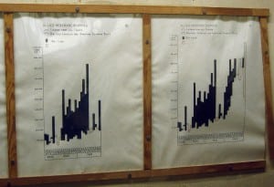
Who needs computers?
I was in the Cabinet War Rooms a little while ago (the bunker where Churchill ran his WWII operations – for anyone not familiar). Something that struck me was the universal use of really clear, concise and well thought out charts, graphs and maps. Here’s a shot of one: The key on this graph…

Smooth bottoms and dashboard design
Most people don’t look at the bottom of their laptop. If they do then they will see one of two things: If it’s a Apple Mac the bottom with be smooth and (with the latest ones) completely featureless apart from four rounded rubber feet. If it’s a PC it will have little hatches, a Microsoft…
Why my phone bill is brilliant.
I’ve just had a bill through from Virgin. It’s not often I find myself smiling when I look at a bill, but this one was a bit different. Virgin have redesigned the bill and put a nice explanation in there as well, see this image (click on it for a bigger version).. I like this…

BlinkCharts, what they are and why you need them
A bog standard Excel chart/graph Most people just use the default graphs on Excel, perhaps with a colour change or two. Who says that Microsoft knows how much detail to put on your graphs? The default graphs (or charts, if you speak Microsoft English) are jam-packed with clutter. Why should you care? Every piece of…
Are your Management Information team on “mission impossible”?
It’s a tough and thankless job producing MI for corporations. Expectations are sky-high (you can thank Star Trek for that) and many departments deliver in spite of huge technical and logistical issues – perversely making their own lives even harder. Being so operationally focussed, it’s rare to have a chance to develop the internal-consulting skills…