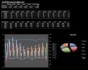
dashboard

How to avoid this common Excel disaster…
On 4 January 2010, in the Marriott hotel in Atlanta, two giants in the world of economics, Prof Carmen Reinhart and former chief economist of the International Monetary Fund, Ken Rogoff, were presenting their research paper, ‘Growth in a Time of Debt’. Their message from their research turned the heads of global leaders and pushed…
KPI report design checklist. How good are your reports?
Introducing the KPI Design Report Checklist You may be trying to work out why your current reports aren’t working properly or wondering if you missed anything on your newly created masterpiece. This design checklist encourages you to consider each element of your design and to score it if you are feeling brave. You can use…

The Problem with Management Information
My local taxi company has been taken over. It has been bought out by Taxi-Rank Services PLC. They have started to apply big business thinking to a small business. It is a revelation. As you know, “what gets measured gets managed” so the first job, post take-over, was to apply a little science to their…

Old news? When not to put data in a dashboard or report.
Some information can be essential to know on a second-by-second basis (heartrate, stock prices or altitude) other information is naturally slower to change; staff survey results, seasonal totals or audit results, for example. A quick way to devalue a dashboard or report and to turn off readers is to put data in the report that…

Dashboard? That’s just a posh name for a report, isn’t it?
I had an interesting conversation with a company lawyer a little while ago. We were discussing dashboards and she said “It makes me laugh when people talk about dashboards, it is just a posh way of describing a report!”. It made me think as it seems to be a common misconception. What is the difference between…

Smooth bottoms and dashboard design
Most people don’t look at the bottom of their laptop. If they do then they will see one of two things: If it’s a Apple Mac the bottom with be smooth and (with the latest ones) completely featureless apart from four rounded rubber feet. If it’s a PC it will have little hatches, a Microsoft…
Why my phone bill is brilliant.
I’ve just had a bill through from Virgin. It’s not often I find myself smiling when I look at a bill, but this one was a bit different. Virgin have redesigned the bill and put a nice explanation in there as well, see this image (click on it for a bigger version).. I like this…
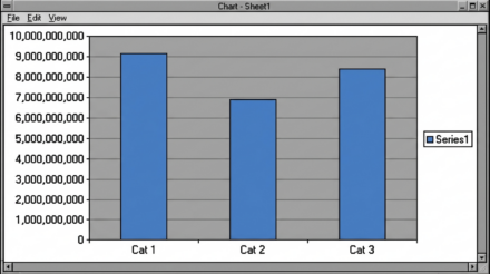
Pointless Pies
I’d like to ban pie charts. I know it’s a bit over the top, but I honestly can’t see a single thing they do better than other graph type (like a 100% stacked bar). They are also hopeless at lots of other things, namely: You can’t trend with them. Yes, you can put a few…

When to leave things out and ignore people….
Sometimes things jar when you first see them. I see this a lot with dashboards that I help design (or redesign). People become very wedded to the look – but more crucially they are wedded to the logic of how something is laid out. I think a brilliant example of this is the modern tube…