


When to leave things out and ignore people….
Sometimes things jar when you first see them. I see this a lot with dashboards that I help design (or redesign). People become very wedded to the look – but more crucially they are wedded to the logic of how something is laid out.
I think a brilliant example of this is the modern tube map (apologies to those of you who know this story).
The map everyone knew
The early tube map was a great map. It showed where the stations were in a nice, geographically correct layout. It also showed faithfully how the lines wiggled their way to their destinations. Now there were a couple of side effects to this. Firstly, the central London section was packed with stations but the suburbs luxuriated in page space. Secondly, the way in which tube routes are picked is similar to trying to harpoon a mouse in the dark, so the layout was not that easy to follow.
Tube map, circa 1920
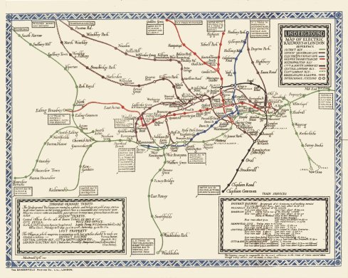
Harry Beck’s better answer
Harry Beck was a London Underground employee who saw a much simpler way of showing the tube lines, stations and intersections. He laid it out like you would lay out an electrical schematic, showing the key relationships rather than every twist and turn of every wire.

New style tube map from 1933
He worked on the new map in his spare time and spent some time and effort trying to convince the management of London Underground of the value of the new approach. I can only guess at the objections to moving to the new system, but they probably included:
- There’s not enough geographic information on here…
- Passengers want it to look like a proper map…
- People will find it confusing…
- I don’t like it…
Eventually Harry Beck won the argument and we ended up with the first iteration of the modern tube map.
What this means for your dashboards
The key parallels I would draw from this tiny bit of history with KPI dashboards and data representation are:
- People resist change (really, Sherlock? I hear you say – but it’s true, irrespective of merit)
- The best solution may involve some loss of information or detail, but improve on clarity and simplicity
- The best solution may only cater to one function, so you may upset some people who used it for something else (just make sure there aren’t too many of these!)
- Colour coding, good layout and visual clarity are valued more highly than you would establish through “just asking” a prospective client – often people don’t realise how much better things can be until they see them.
Next time you need to make a major change to MI, presentation or layout, take feedback but don’t rush the customer or client into liking the new design. The key is how the users feel after a few exposures. Sometimes a few weeks can take someone from outrage to evangelism.
Here’s to you, Harry!

Harry Beck
Next steps
- 5 common dashboard design mistakes (and how to fix them)
- Free Excel KPI dashboard templates – clear, simple layouts your users will thank you for
Get practical KPI advice in your inbox
Join the free KPI newsletter for plain-English guides like this one. No fluff, unsubscribe any time.
I’ll only email you the newsletter. Unsubscribe in one click.


