


Bernie Smith

Explaining complex things simply: Wise words from Silvanus P Thompson
A good friend of mine showed me his treasured copy of ‘Calculus Made Easy’ by Silvanus P Thompson, first published in 1910. Here’s the front cover… First published in 1910, here are some wise words on explaining complex things simply from Silvanus… CONSIDERING how many fools can calculate, it is surprising that it should…

Contradictory KPIs. When KPIs should agree, but don’t
Contradictory KPIs are a common problem and can rapidly undermine management confidence in the KPI system. Even someone who knows nothing about measurement knows that if you look at, say, a figure for widget production in July 2007, then you would expect any other figures for widget production in July 2007 to be the same,…

Common KPI Problems – Stranded Data
There are lots of practical data problems you are likely to come across when implementing KPIs and measures. I’ve identified five of the most common ones. The first of this series is ‘Stranded data’ or data living in small pools throughout your organisation. This issue is fairly simple to spot but probably the toughest of…
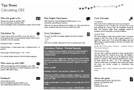
KPI Cheat Sheet – Making KPIs and Measures Easy to Understand
Most KPIs are really badly documented, if they are documented at all No matter which industry, I find three things are consistently true of KPIs KPIs and measures are not fully understood by all of those using them KPIs and measures are poorly documented The documentation that does exist is almost unreadable Performance measurement and…

Assessing Report Design Objectively – Avoiding Fights
There are three situations where it can be a good idea to have a structured review of your reports and dashboards… If some of your team are in denial about the need to change existing reports You want some clear ideas on what needs to be included in improved dashboards or reports You have an…

Insider Tips from an OKRs Coach
OKRs and KPIs go together ‘hand in glove’. In this article Ben Lamorte of OKRs.com gives us some practical examples of OKRs. Check out his introduction to OKRs – ‘Taking KPIs to the next level with OKRs‘ in his earlier blog for a bit of background on OKRs. OKRs, being clear on terminology Before we…

Free Meetings Terms of Reference Template
Report bloat is a significant problem in many organisations. Much of this problem stems from the people producing reports and dashboards not being clear on how they are being used and which parts of their output are even looked at. In short, they don’t understand the purpose of their reports. To design reports and dashboards…
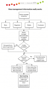
How we ‘really’ use management information…
When we are kids we have models of how we think things work. For example, stick people with arms coming from the middle of their bodies or the sky being a thick blue line across the top of a drawing. As adults we still carry lots of models in our minds, including how we use…

Dashboard design – lessons from Britains ‘lost bomber’
Part of being a geek includes dragging your family round aircraft museums. Wandering round the Imperial War Museum in Duxford last week I came across an impressive looking failure – the TSR2. Britain, like many wealthy countries, has a long and grizzly history of defence projects going wrong. The TSR2 was envisioned initially as a…
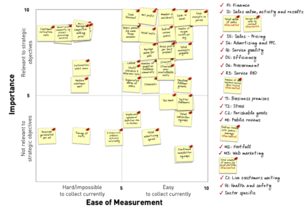
How Many KPIs Should I Have? A Guide on How to Choose the Right Metrics
Having too high a number of KPIs isn’t just annoying – it’s dangerous for your business. When organisations track an overload of metrics, they often face: Decision paralysis Wasted time and resources Confused and overwhelmed teams Diluted focus on what truly matters This leads to the common question: “How many KPIs should I have?” But how do you…