Design
“Compressor on”, how to label your reports more clearly
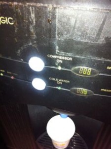
I just poured myself a cup of water from the water chiller. I noticed that it helpfully offers two temperatures of water and has a little light with “Compressor on” next to it. Why would you put this on a customer facing display? What they really mean is “this water cooler is working and cooling…
When to leave things out and ignore people….
Sometimes things jar when you first see them. I see this a lot with dashboards that I help design (or redesign). People become very wedded to both the look – but more crucially they are wedded to the logic of how something is laid out. I think a brilliant example of this is the modern…


