


Post
How to measure “difficult to measure” things.
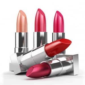
What lipstick, the Panama Canal and toilet breaks can tell you. There are some things that are difficult to measure, maybe even impossible to measure directly. The key with ‘difficult to measure’ things is to look at something that either affects or is affected by the thing you are interested in. Here are three examples of…
Painful report production? Why you should be worried…
The problem with a good Reporting/MI/Analytics team is that they make it all look too easy. They will often go through a very painful report production process (particularly for executive meetings) and deliver against all the odds. This usually involves heroic efforts of chasing, data manipulation and spreadsheet gymnastics. The reports get generated and the Reporting/MI/Analytics…
Using KPIs to improve your business
I’m often asked how to create KPIs and measures. It’s not a short process, which is why most people end up brainstorming or using existing measures when they are tasked with doing this (check out this article – Six KPI Selection Traps to Avoid to see some of the other pitfalls). The good news is…
The “King Midas” award for Measures with Unintended Consequences
King Midas is famous for an apparently good idea – everything he touched turning to gold – with unexpected side effects – starvation. I regularly stumble across less dangerous variations on this theme, with measures that create completely unintended consequences. I’m looking for your favourite examples of bad measures, KPIs or metrics. The winner will…
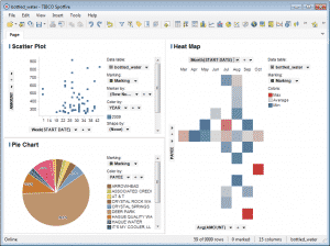
Tibco Spotfire 4.5 Hands-On Review
What is Spotfire? Spotfire is a BI (business intelligence) tool that enables you to explore and represent “big data” sets. It’s one of a class of tools that focus on making it easy to explore masses of data without being a database ninja. It’s head-to-head with tools like Tableau and Qlikview. I’d previously been put…
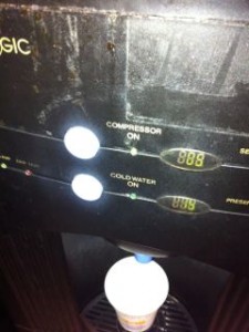
“Compressor on”, how to label your reports more clearly
I just poured myself a cup of water from the water chiller. I noticed that it helpfully offers two temperatures of water and has a little light with “Compressor on” next to it. Why would you put this on a customer facing display? What they really mean is “this water cooler is working and cooling…

How to keep your reports short and effective
Which is the easier question to answer?: “Tell me about France” or, “Tell me about the restaurants in the village of Venosc that serve Italian food” ? It’s very obviously the latter (assuming you have the information available in the first place). It’s the difference between these two questions that explains how some reports can be…
First look – Qlikview Review – Version 10 Personal Edition
As promised in my last “first look” review, I’m taking Qlikview 10 for a spin. For those of you not familiar with Qlickview it’s a data visualization tool that’s designed to make the creation of ad-hoc reports and dashboards, from existing data, quick and simple. Installation Getting hold of Qlikview is a matter of registering…
First look – Tableau 6.1, Data Visualisation Software
I spend most of my time with clients trying to get more out of their existing tools, more often than not some combination of an ERP tool (JDEdwards, SAP etc.) a selection of more “pure” databases such as Oracle, Access, SQL and a lot of spreadsheets. All of these tools have well understood strengths and…
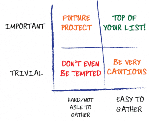
Too many measures, not enough space?
A really common problem I see is that at some point, no matter how small you make the graphs and tables, you run out of space to show everything you want to show in a report or dashboard. What do you do? You can leave stuff out, but that can often unbalance the view you…