First look – Qlikview Review – Version 10 Personal Edition
As promised in my last “first look” review, I’m taking Qlikview 10 for a spin. For those of you not familiar with Qlickview it’s a data visualization tool that’s designed to make the creation of ad-hoc reports and dashboards, from existing data, quick and simple. Installation Getting hold of Qlikview is a matter of registering on their web site and downloading the “personal” edition. The personal edition has the limitation of not being able to share your Qlickview files with any other users, but doesn’t appear to have any other time or functionality restrictions. You will probably want to download the tutorial. This is made up of some sample files and a PDF tutorial. Whilst a PDF feels a bit “old school” however it is clearly written and progressive, making it pretty easy to follow. Interface 
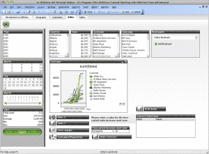
Applying the “man test” Being a vain middle aged man I prefer not to read tutorials and instructions. The “man test” is very subjective, and in this case I did resort to reading the tutorial (whereas with Tableau I was compelled by child-like curiosity to cobble something together without instructions). This isn’t to say that Qlickview isn’t intuitive – it’s really very good, but it’s not quite as visual and inviting as apps such as Tableau. Features that really stood out Qlikview seems to bring the data to the fore. Your start point is very much the fields that make up the database and you then add charts onto this. One of Qlickviews specialities – they call it the Associative Engine – seems to be the ability to filter all linked fields in other tables when selecting any field in any table. It greys-out not applicable data and highlights linked data in white – so you understand the associative relationship (or not) between datasets. I think I’d need to use this tool in anger on my own data set to really understand the benefits of this approach, but it seems logical and intuitive – all good. Dashboards are quick and easy to create, at least as simple as Tableau – they are both drag-and-drop efforts. Qlikview makes it fractionally easier to tweak the look and feel of objects. Tables are easy to create and to drop into dashboards. Interactivity on tables and charts is excellent, allowing you to reselect data and ranges on the fly. Things I didn’t like This type of tool is all about delivering insight from your data. This inevitably includes charts. Working through the tutorial I was very disappointed by the standard of charts shown. Now it may well be possible to tweak these graphs to follow better practice, but frankly we shouldn’t have to. Having charts like this: 

- Over the intra/internet
- To a dedicated client app on your PC
- To mobile phones/tablets (iOS, Blackberry and Android supported)
- Export to Excel
Pretty much every method you could hope for, save carrier pigeon. Verdict I like the ease of use of Qlikview. I was very under-whelmed by it’s charting ability- it feels like the defaults and the tutorial regard graphic representation as an afterthought – this was backed up by their sales person commenting on the “pretty graphs” of their rival – Qlikview – you just don’t seem to get it! The company are making great play of the way it handles data, and specifically the relationship between that data, so I think it merits some further investigation. Watch this space for some longer-term road testing and a more in-depth review.


Hi Bernie,
I wonder how you ended up with those charts? Was this in the tutorial file? Starting with QlikView 9, the default look for charts is much cleaner (though admittedly not as clean as some competing products) than the ones shown here.
To answer your question about what happens when you exceed available memory. At that moment, Windows will start swapping memory to disk, which will absolutely kill the performance of your QV application. It is therefore very important to properly plan the capacity of your server hardware, especially RAM.
Cheers,
Barry
Thanks Barry. Yes the charts were from the tutorial. Thanks also for clearing up the RAM question.