


Posts
The “King Midas” award for Measures with Unintended Consequences
King Midas is famous for an apparently good idea – everything he touched turning to gold – with unexpected side effects – starvation. I regularly stumble across less dangerous variations on this theme, with measures that create completely unintended consequences. I’m looking for your favourite examples of bad measures, KPIs or metrics. The winner will…

Using 5S to improve report and dashboard design
5S is a tool that lots of manufacturing businesses use. It’s a funny tool as it can look quite superficial unless you have been involved in a project where it has been applied properly. What people often miss is the mindset that goes along with it. When you start living and breathing 5S some quite…

Strategy Checklist: Is your strategy ready to support meaningful measures and KPIs?
Why is a strategy checklist important? Imagine a friend saying to you “Can you pop out to the hardware store and buy a tool for me?”. Obviously, your first question would be “What kind of tool are you looking for?” Deciding on your measures and KPIs without having a clear strategy is exactly like going…
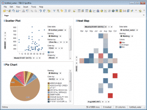
Tibco Spotfire 4.5 Hands-On Review
What is Spotfire? Spotfire is a BI (business intelligence) tool that enables you to explore and represent “big data” sets. It’s one of a class of tools that focus on making it easy to explore masses of data without being a database ninja. It’s head-to-head with tools like Tableau and Qlikview. I’d previously been put…
KPI report design checklist. How good are your reports?
Introducing the KPI Design Report Checklist You may be trying to work out why your current reports aren’t working properly or wondering if you missed anything on your newly created masterpiece. This design checklist encourages you to consider each element of your design and to score it if you are feeling brave. You can use…
30 Second Tip: Do you spend too much time looking backwards?
Look at your main KPIs, do they look forwards or backwards? Do you spend most of your time looking at financial measures that tell you how things were a few weeks or months ago? It’s good to include a number forward-looking measures, that indicate how you will do, as there’s still time to change the…

The Problem with Management Information
My local taxi company has been taken over. It has been bought out by Taxi-Rank Services PLC. They have started to apply big business thinking to a small business. It is a revelation. As you know, “what gets measured gets managed” so the first job, post take-over, was to apply a little science to their…
Putting the Key into Key Performance Indicators
How many “top level” KPIs do you have? If you have more than 10 top-level measures then you probably have too many. Building a measurement hierarchy (using a KPI Tree) can help show which ones are crucial. Remember to focus on the indicators that support your strategy. If you want to find out how to…
Do the “blink” test on your reports
Review your reporting, can you tell at a glance how your business is performing? Can you (and the rest of your team) easily tell how your organisation is doing, even after coming back from holiday? If you can’t, consider designing a report template and making things visual, with more charts and performance icons. Here is…
30 Second Tip: An obvious thing that never gets done….
Define you measures. Make sure each measure is clearly described, has an owner, has a documented way of calculating it, the source of the information, what it’s intended to do, how it should be reported and what action should be taken based on what it’s saying. Here is a KPI Definition Checklist that will help you do…