Refresh
Why being bad can be good – Targets, measures and dissonance
I’ve often found that people often get very uncomfortable if you change a measure to show poorer perfomance even if you lower the target proportionately. Let me give you an example. I worked with a paper manufacturer a few years ago. Their (flawed) efficiency measure showed them bobbing between 95 and 105% efficiency. Anyone with…
Razor burn and pseudoscience
I tend to get sore skin if I shave with the wrong type of shaving gel. I’ve finally found a shaving gel that works (Nivea for Men, Sensitive, in case you are asking). What the hell has this got to do with KPIs? Well you can buy at least a dozen different brands of shaving…
Six KPI selection traps to avoid
Here are some really bad ways to choose the measures you use and report on: Interesting measures – People are driven by curiosity and that’s great, but don’t overdo it. I once worked with a call centre that had 128 KPIs, they just couldn’t bring themselves to leave any out. This is a symptom of…
Data Analysis – 10 Point Checklist
How good is your organisation at analysing the data you produce? Carefully answer these questions (you can use a 1-5 scale to improve the resolution of the checklist, where 1 is low/poor and 5 is high/strong). Are data and reports separate entities? Does revision of reports require manual intervention? Is there flexibility in cutting data…
Data Production – 10 Point Checklist
How good is your organisation a producing the data you need? (we aren’t talking about analysis, see this analysis checklist for that). Carefully answer these questions (you can use a 1-5 scale to improve the resolution of the checklist, where 1 is low/poor and 5 is high/strong). Does data arrive in a structured way, ready…
When bad is good
I’ve just seen a great example of conflicting measures. It’s from the NHS. Today’s Telegraph explains how NHS managers are deliberately making patients wait, as treating patients quickly “raises expectations”. What this actually means is that if you make people wait long enough (taking care to stay inside the current 18 week limit) they will…
Who needs computers?
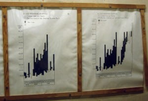
I was in the Cabinet War Rooms a little while ago (the bunker where Churchill ran his WWII operations – for anyone not familiar). Something that struck me was the universal use of really clear, concise and well thought out charts, graphs and maps. Here’s a shot of one: The key on this graph…
Smooth bottoms and dashboard design
Most people don’t look at the bottom of their laptop. If they do then they will see one of two things: If it’s a Apple Mac the bottom with be smooth and (with the latest ones) completely featureless apart from four rounded rubber feet. If it’s a PC it will have little hatches, a Microsoft…
Why my phone bill is brilliant.
I’ve just had a bill through from Virgin. It’s not often I find myself smiling when I look at a bill, but this one was a bit different. Virgin have redesigned the bill and put a nice explanation in there as well, see this image (click on it for a bigger version).. I like this…
BlinkCharts, what they are and why you need them
A bog standard Excel chart/graph Most people just use the default graphs on Excel, perhaps with a colour change or two. Who says that Microsoft knows how much detail to put on your graphs? The default graphs (or charts, if you speak Microsoft English) are jam-packed with clutter. Why should you care? Every piece of…


